
Sofia Bertini Portfolio
SOFIA BERTINI Milan · Available worldwide
All works
01

OpenEconomics

Designing clarity for public funding, economic evaluation and strategic investment.
Scope

Editorial Design
AI Art Direction
Digital Communication
Presentation Design

Year

2025–2026

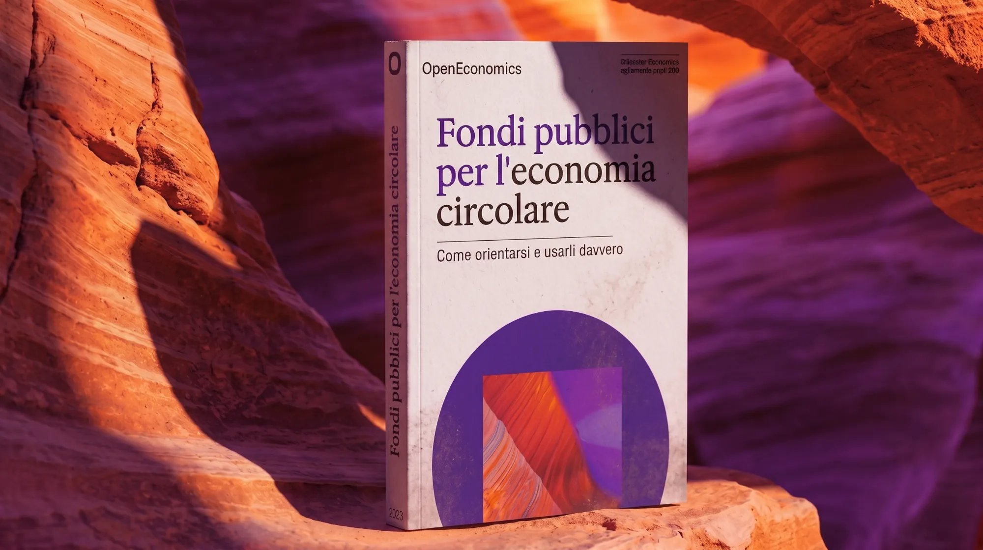
OpenEconomics book render
Partnership principle coverPublic Funding cover
Partnership principle diagramPublic Funding editorial statement
OpenEconomics AI-generated European Parliament
OpenEconomics AI-generated city aerial
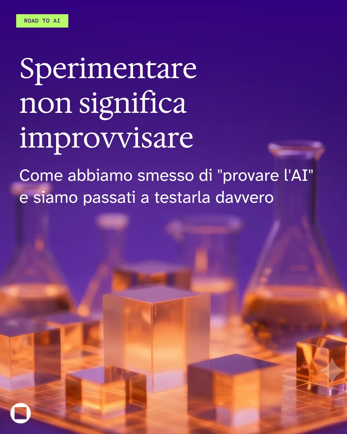
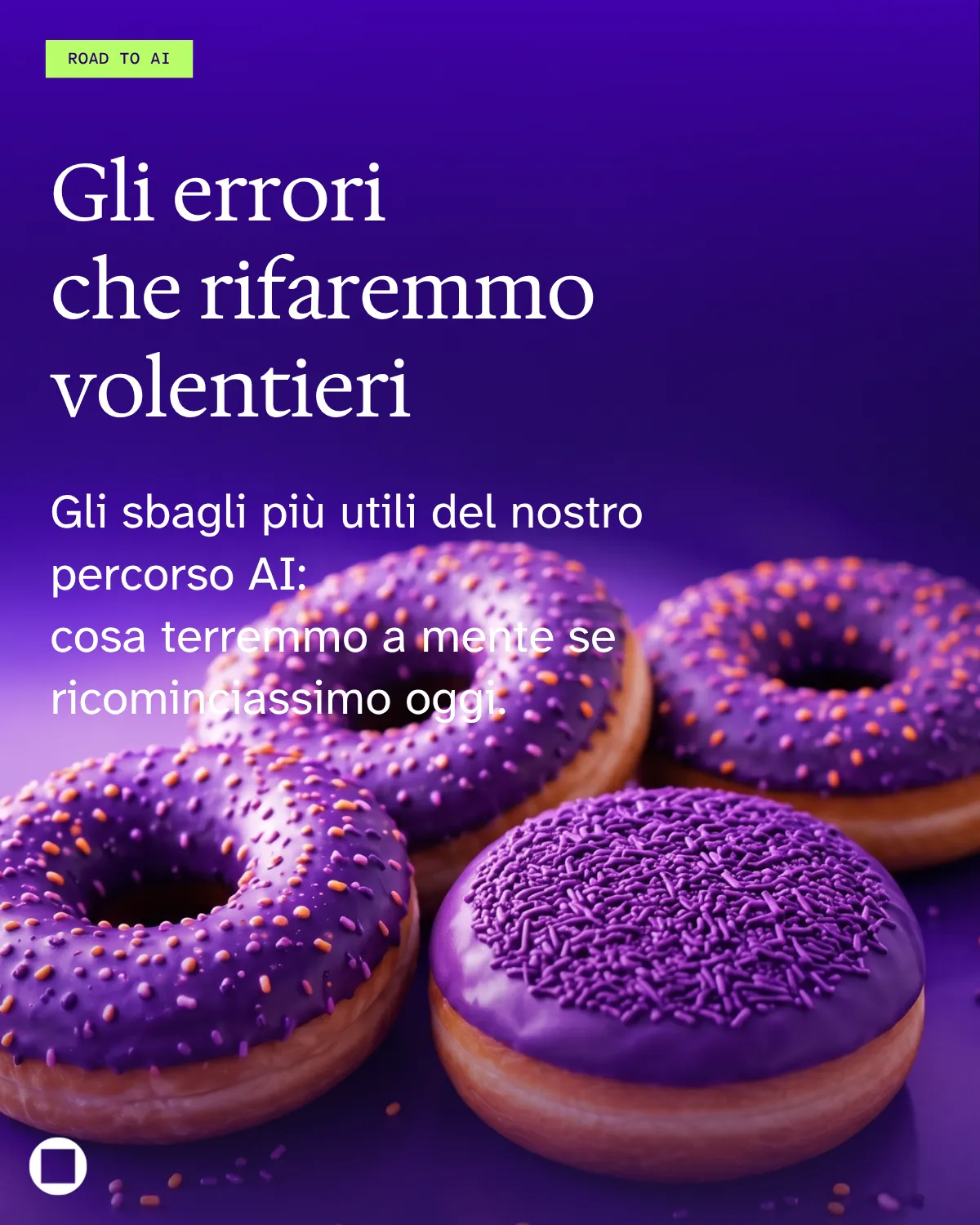
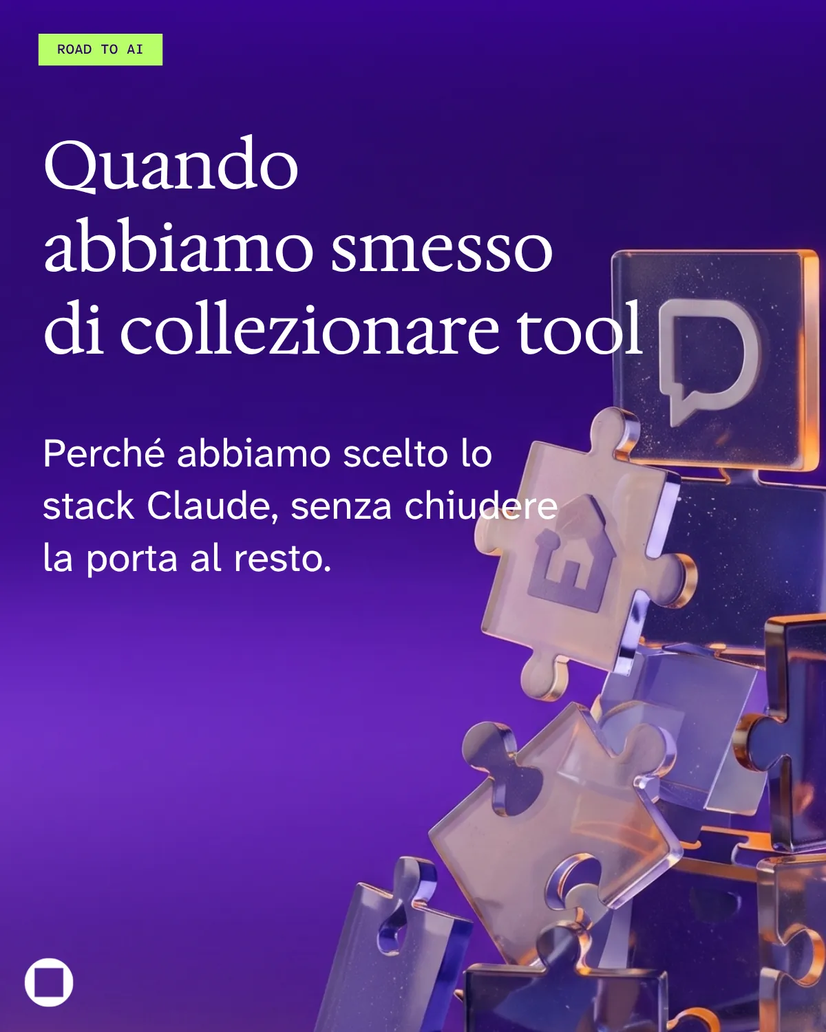
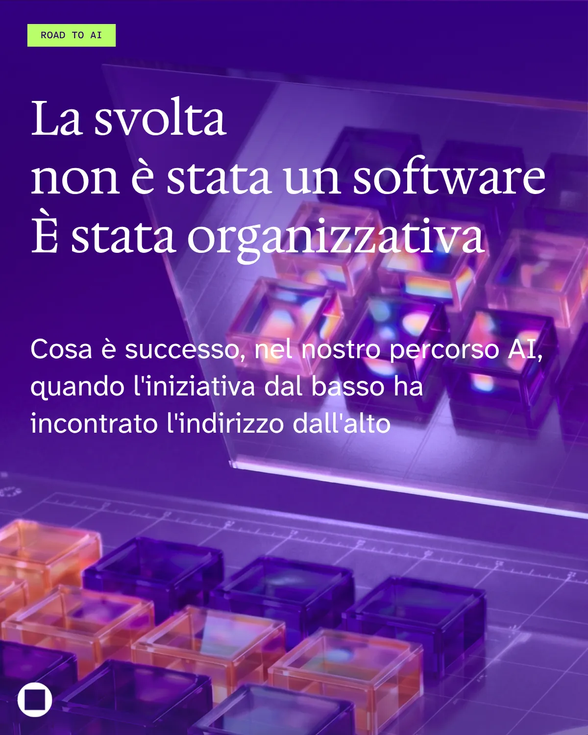
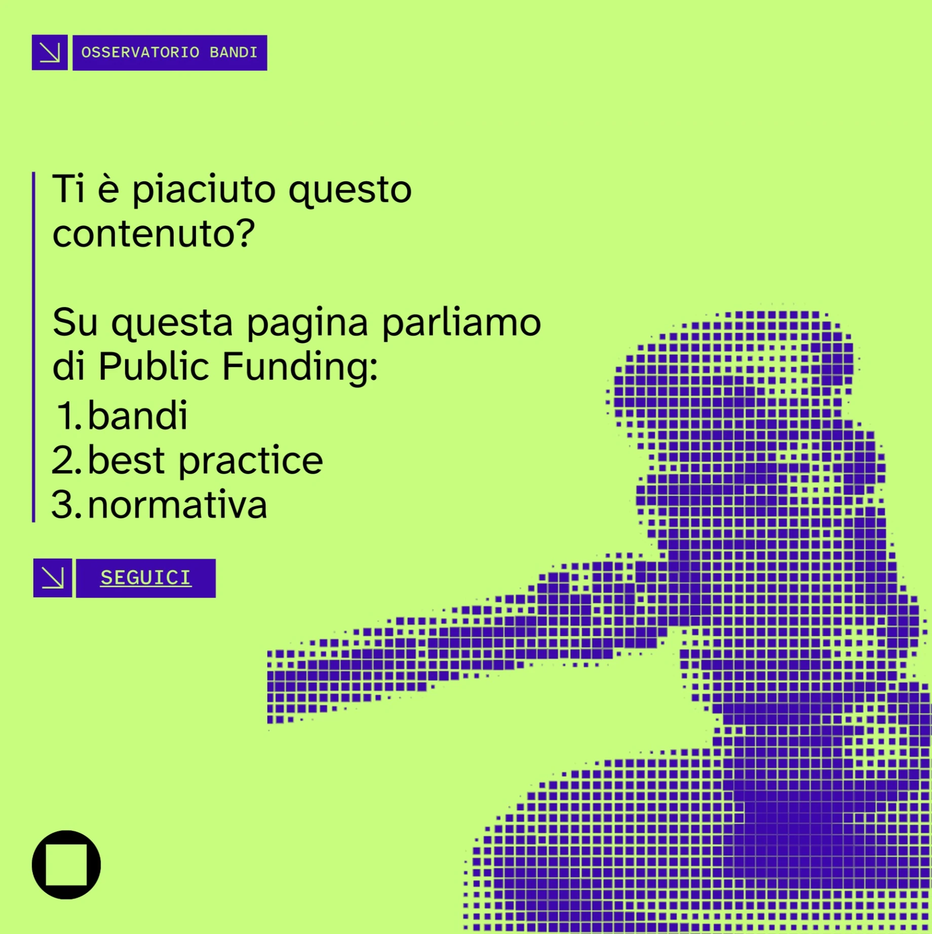
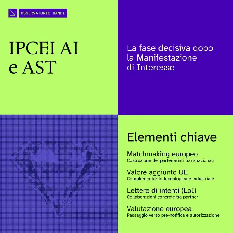
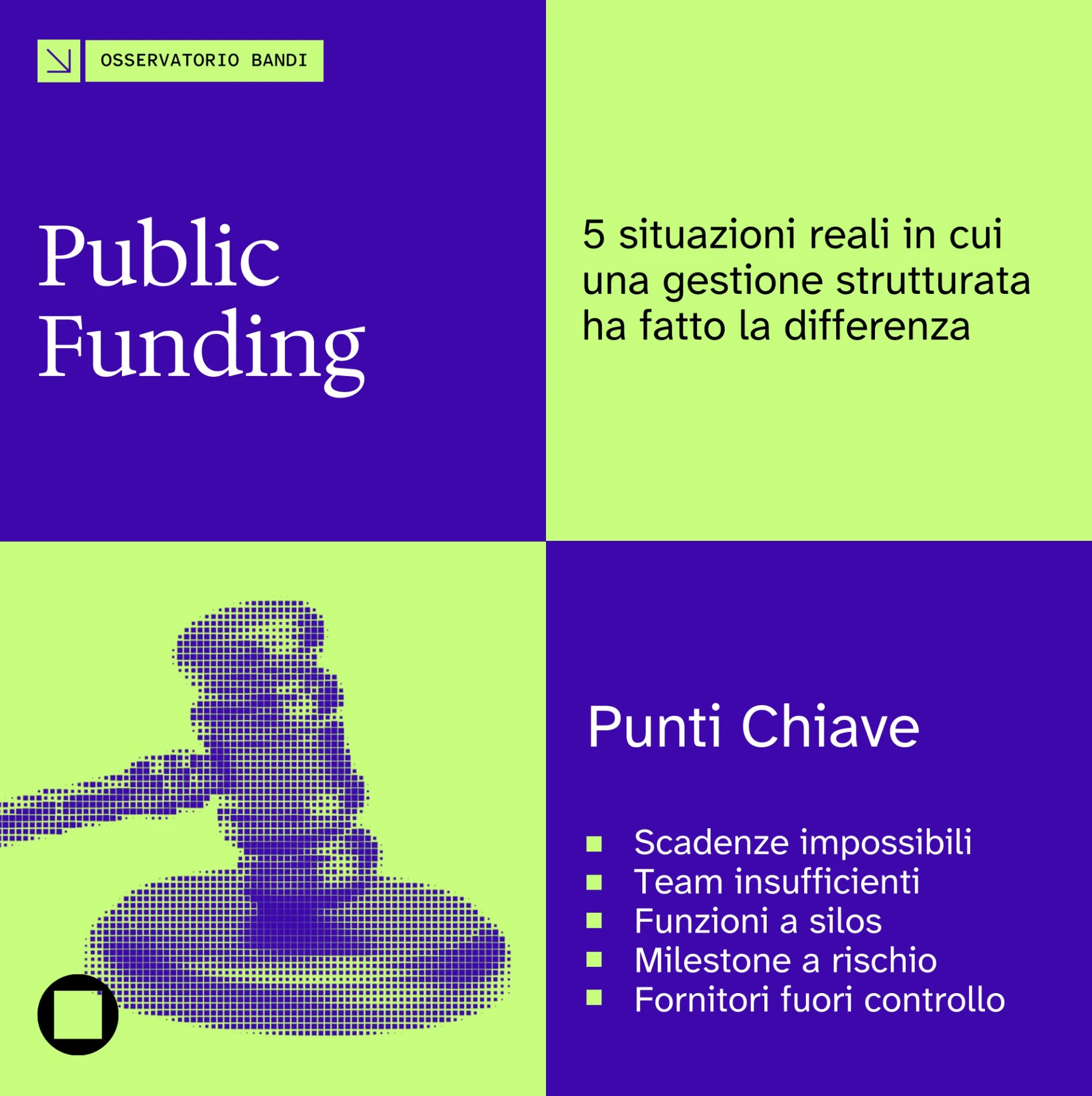
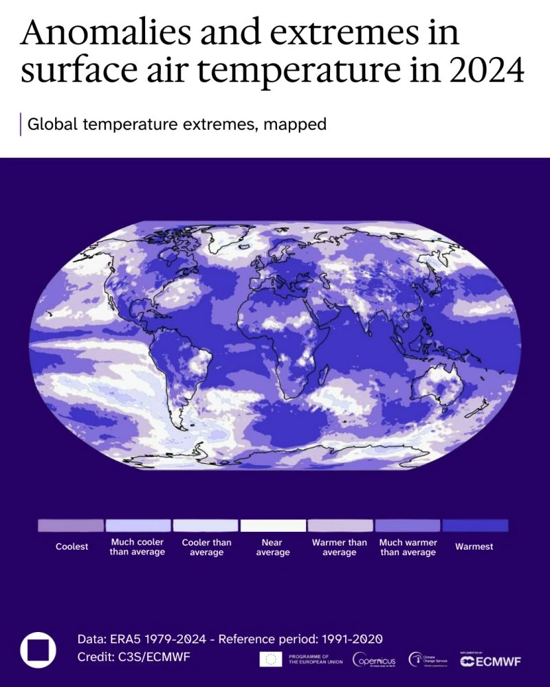
OpenEconomics Osservatorio Bandi — follow OpenEconomics Osservatorio Bandi — IPCEI AI e AST OpenEconomics Osservatorio Bandi — Public Funding OpenEconomics LinkedIn post — temperature anomalies 2024
Overview

OpenEconomics needed a communication system able to make highly technical topics clear, recognisable and engaging.

The project spans publications, LinkedIn editorial series, presentations, website assets and AI-generated imagery. One editorial grammar of typography, colour and hierarchy connects every format, while abstract textures, halftones and AI images add depth to corporate content. The result is a flexible language built to scale across touchpoints.
02

SanPietro

Translating Italian leather craftsmanship into a contemporary luxury identity.

Scope

Brand Identity
Logo Design
Art Direction
Visual Language

Year

2025

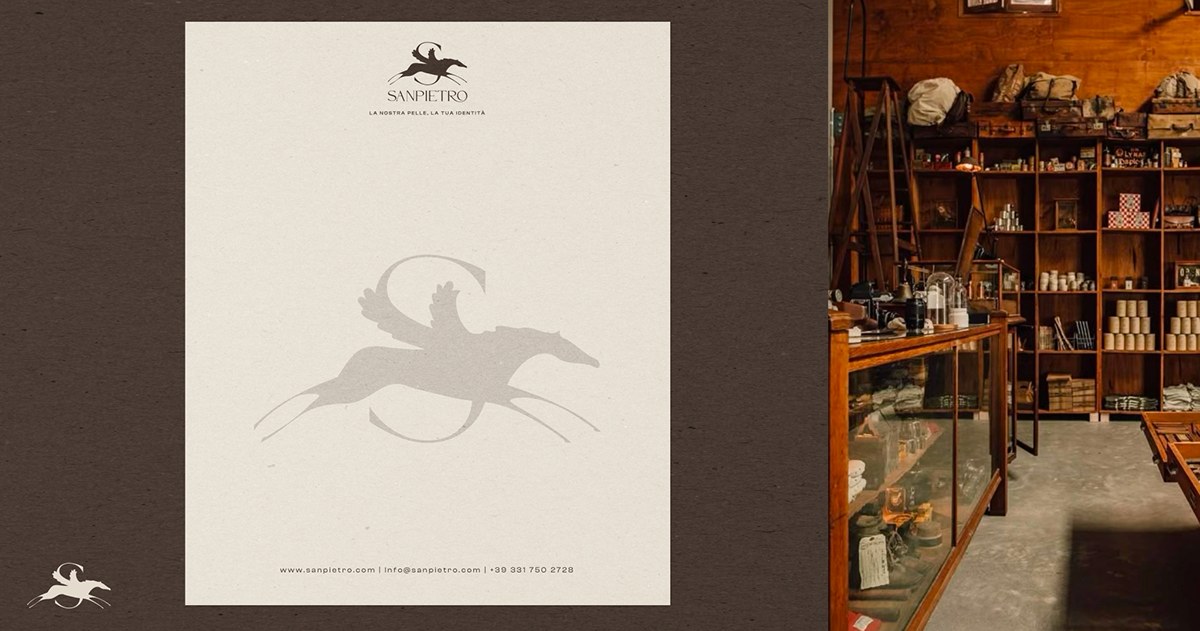
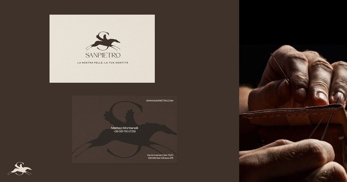
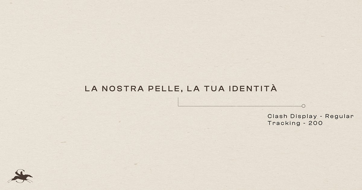
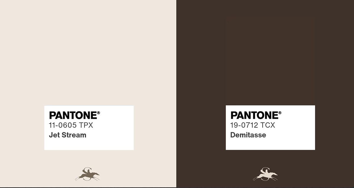
SanPietro brand identity board 08
SanPietro brand identity board 07
SanPietro brand identity board 06
SanPietro brand identity board 05
SanPietro brand identity board 04
SanPietro brand identity board 03
SanPietro brand identity board 02
SanPietro brand identity board 01
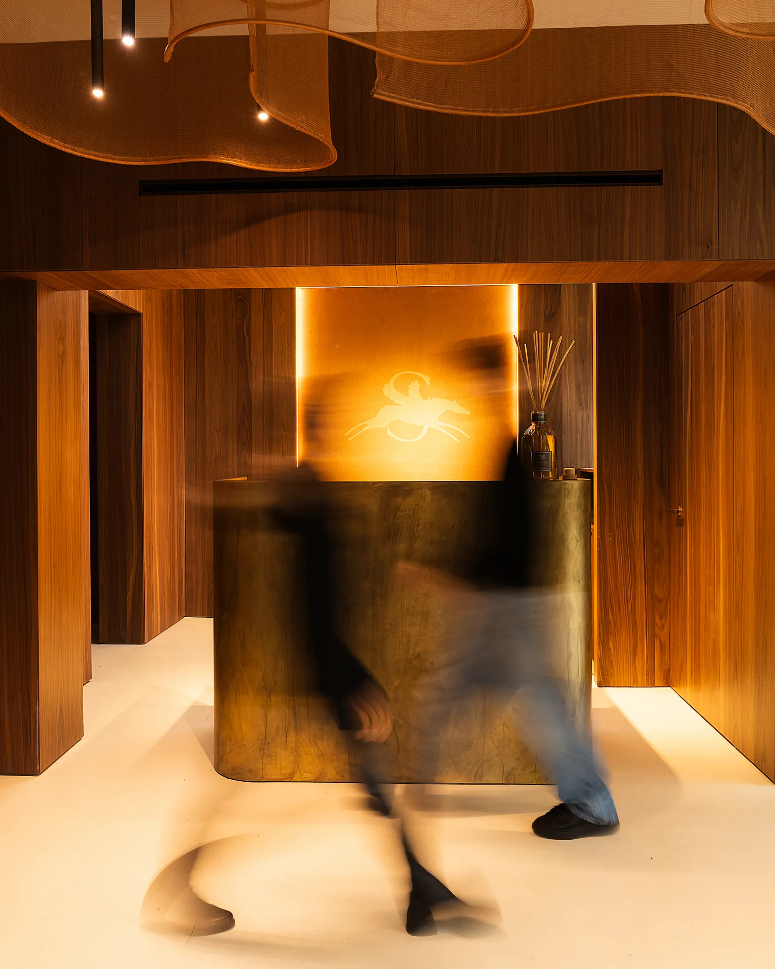
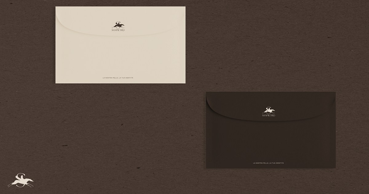
SanPietro interior and illuminated logo
Hands weaving leather
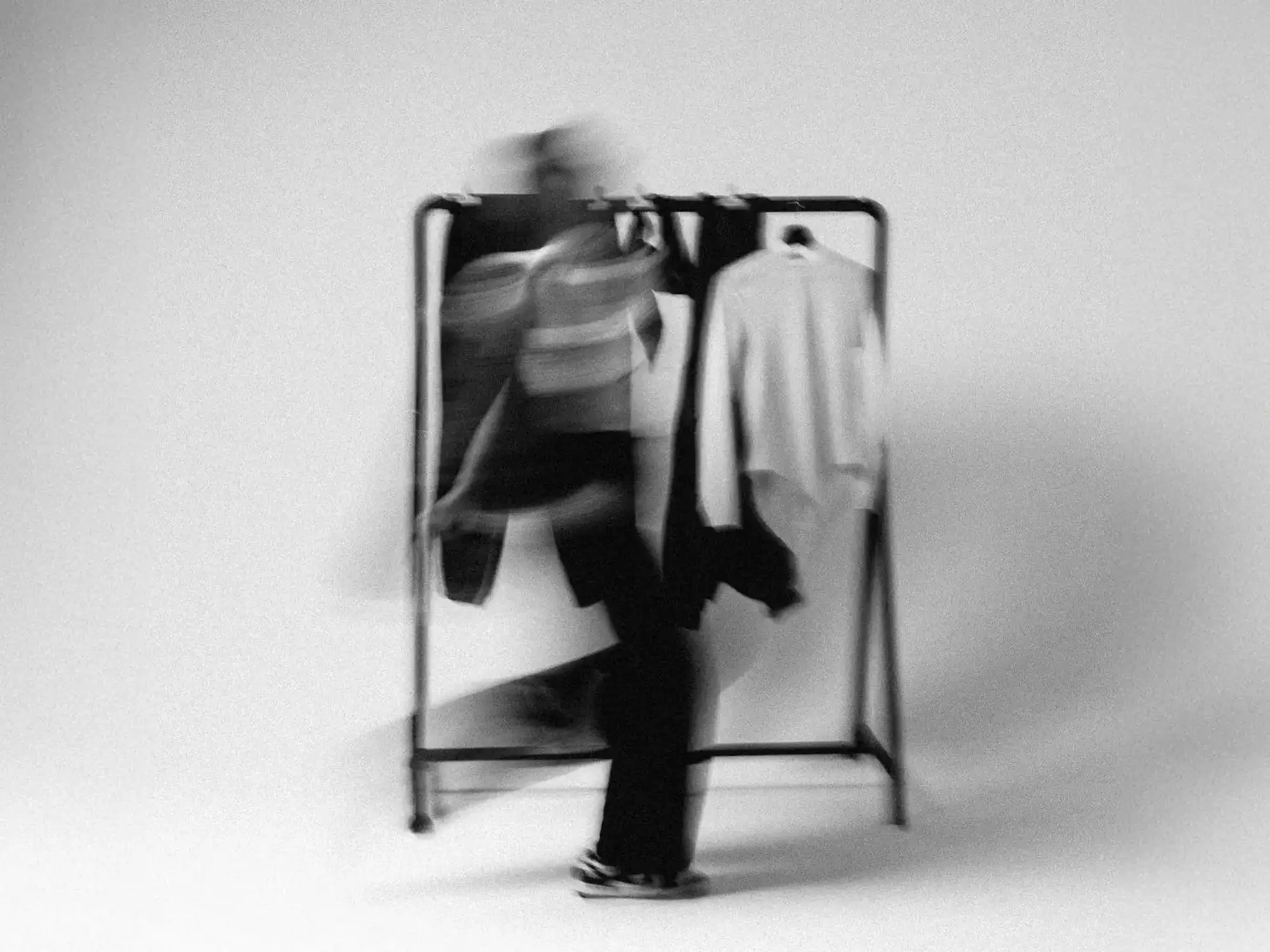
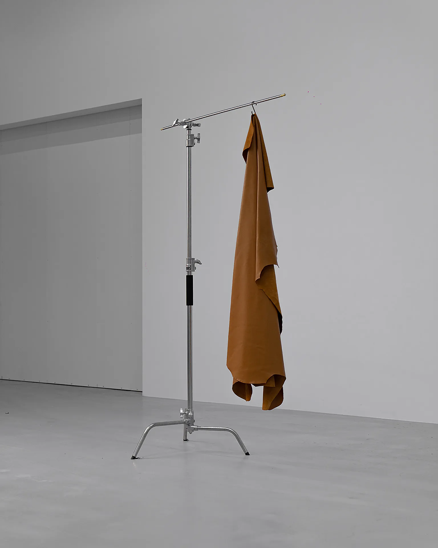
Leather hanging in a studioSanPietro visual language
Abstract horse in motion
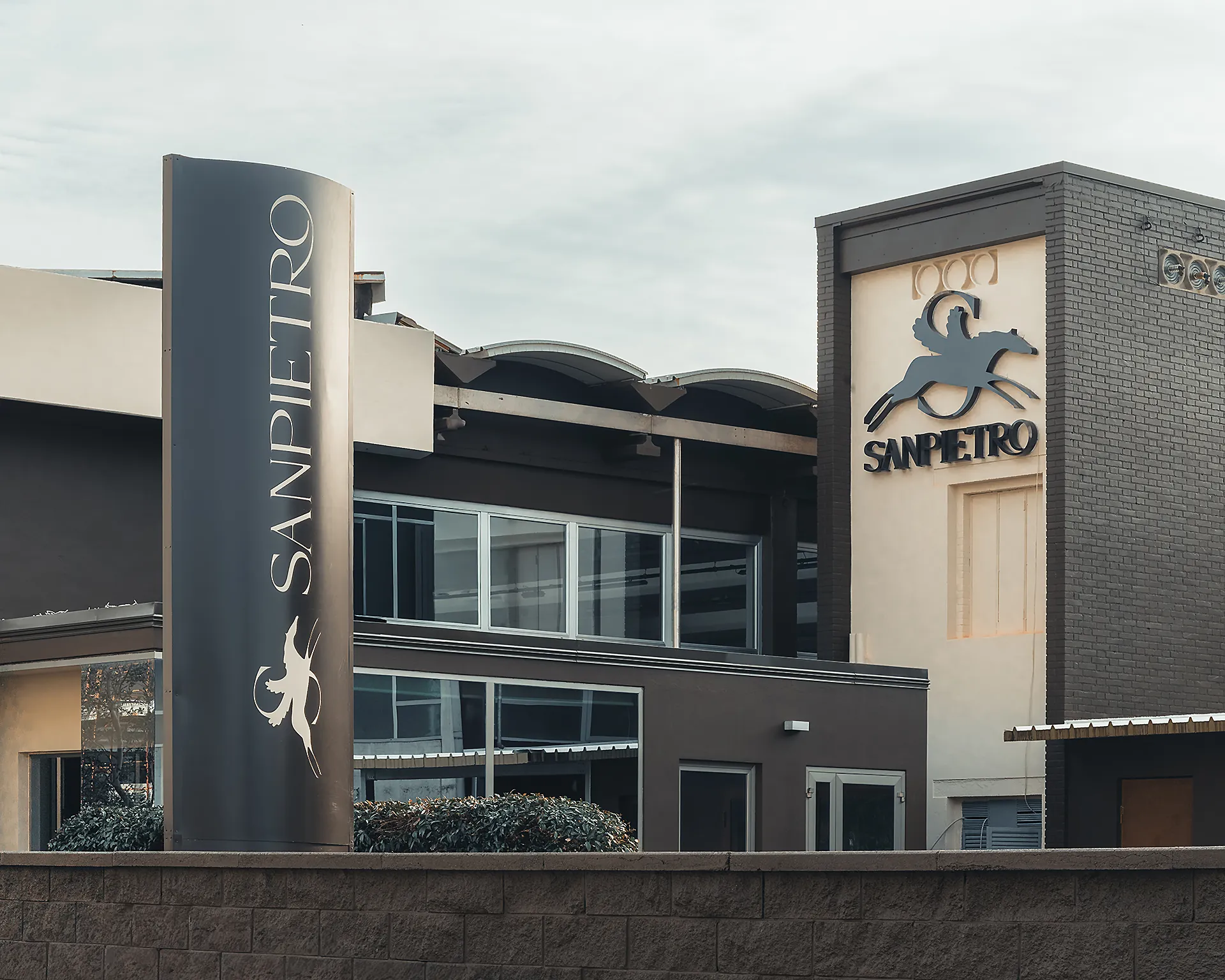
SanPietro building signage
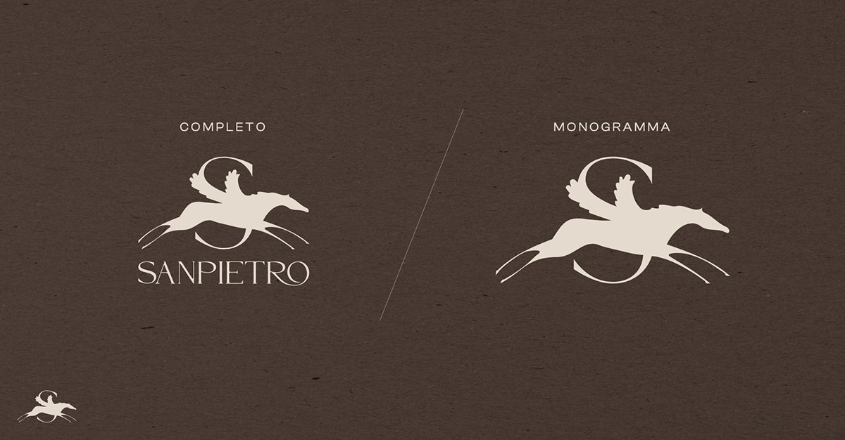
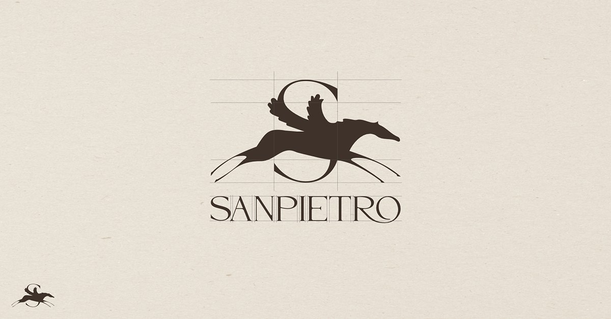
SanPietro logo
Overview

A contemporary luxury identity for a historic Italian tannery, where craftsmanship is the identity.

The visual language starts from the process itself: hands, leather and transformation. The horse symbol connects heritage, motion and excellence, while a restrained palette and typography carry the mark from photography to signage and architecture. The result communicates heritage without looking nostalgic.

03

Del Tongo

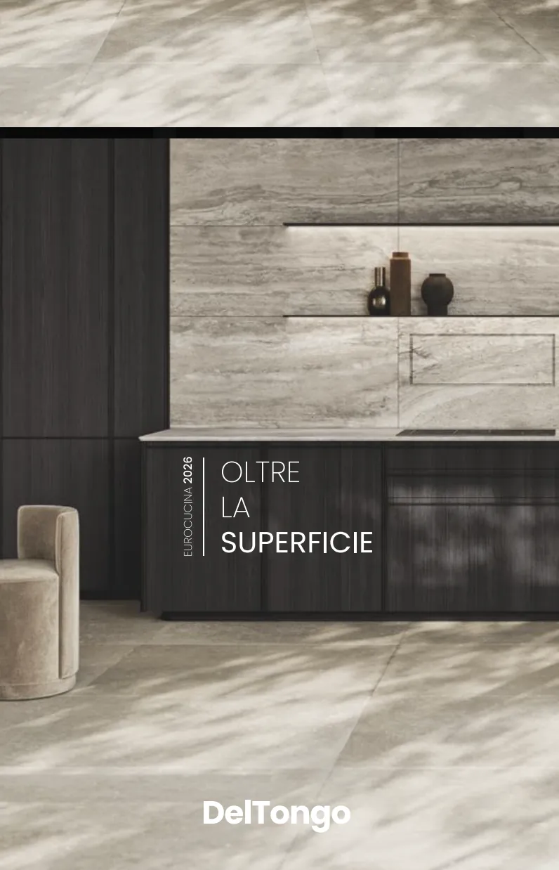
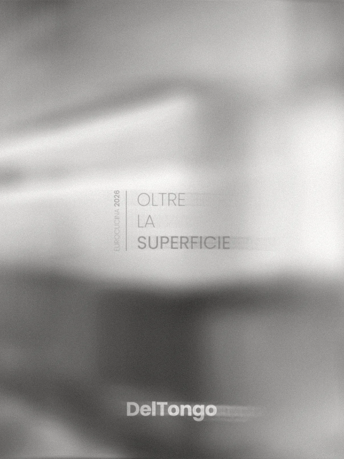
“Oltre la superficie” — a concept campaign for Eurocucina 2026.

Scope

Creative Direction
Campaign Concept
Visual Research
Digital Launch

Year

2026

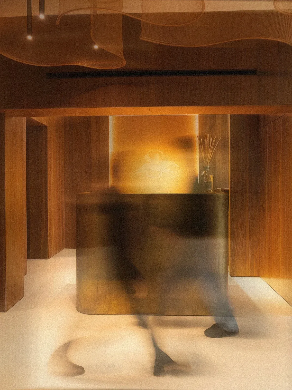
Del Tongo — kitchen beyond the surface
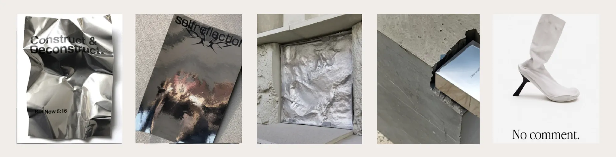
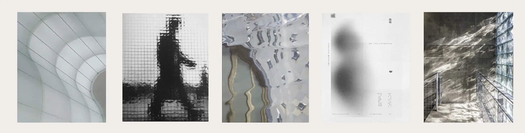
Del Tongo hidden forms moodboard
Del Tongo contrast moodboard
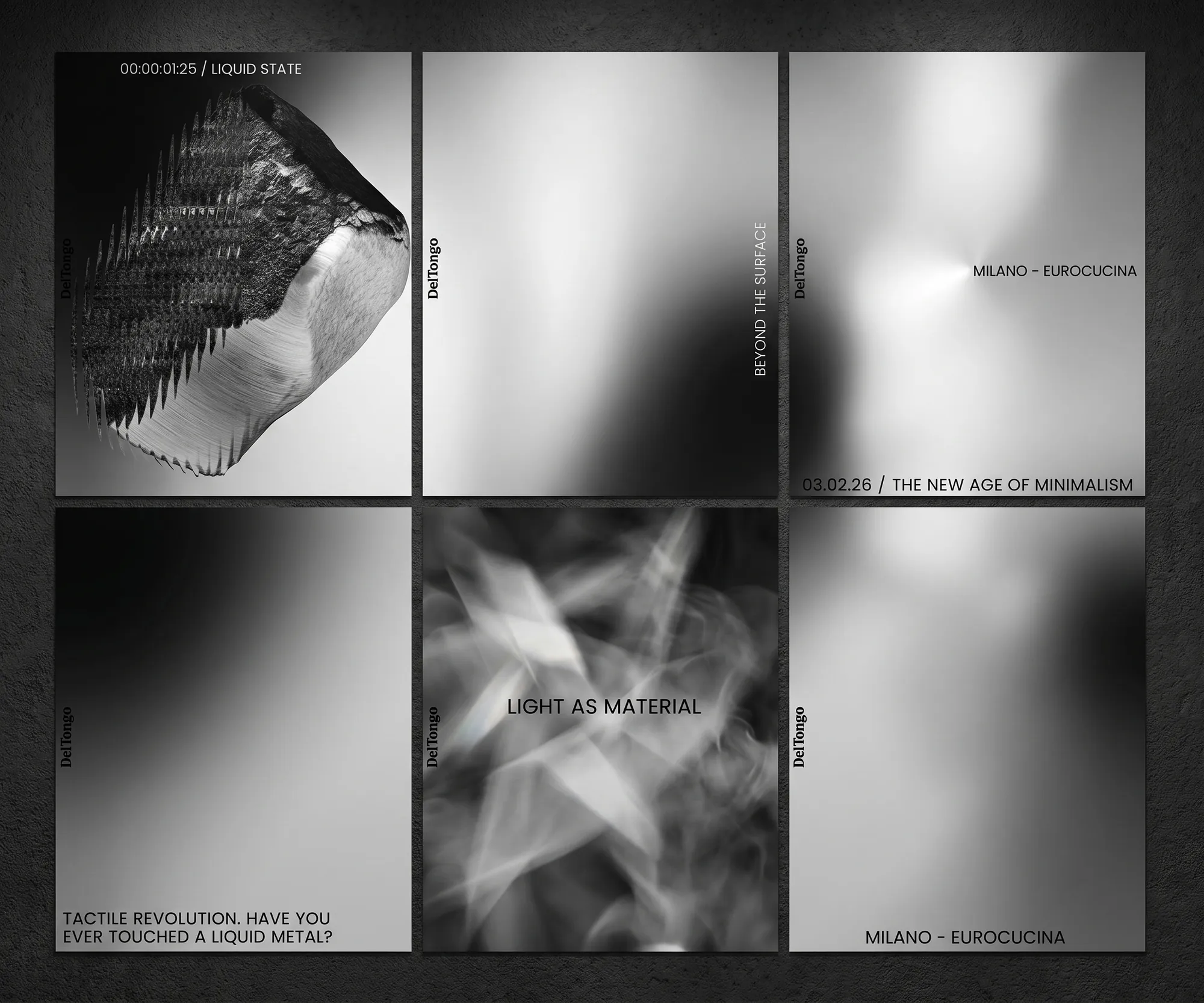
Del Tongo campaign visual system
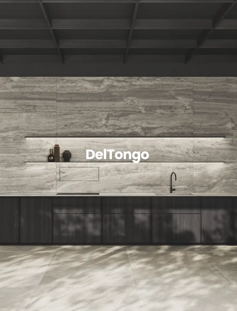
Del Tongo kitchen launch visualDel Tongo Oltre la superficie product visual
Overview

“Oltre la superficie”: a launch campaign for Eurocucina 2026 that leads with atmosphere before product.

Moodboards built a territory of hidden forms and sharp contrasts, treating light as a material through blur, reflection and controlled distortion. The language moved into social and event assets, building anticipation until the kitchen itself is revealed.

04

Culture Strike

A cultural identity system designed for impact across city, stage and communication.

Scope

Brand Identity
Logo Design
Event Branding
Environmental Graphics

Year

2025

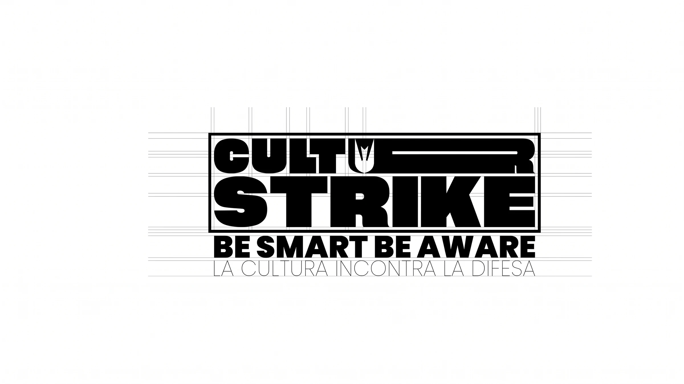
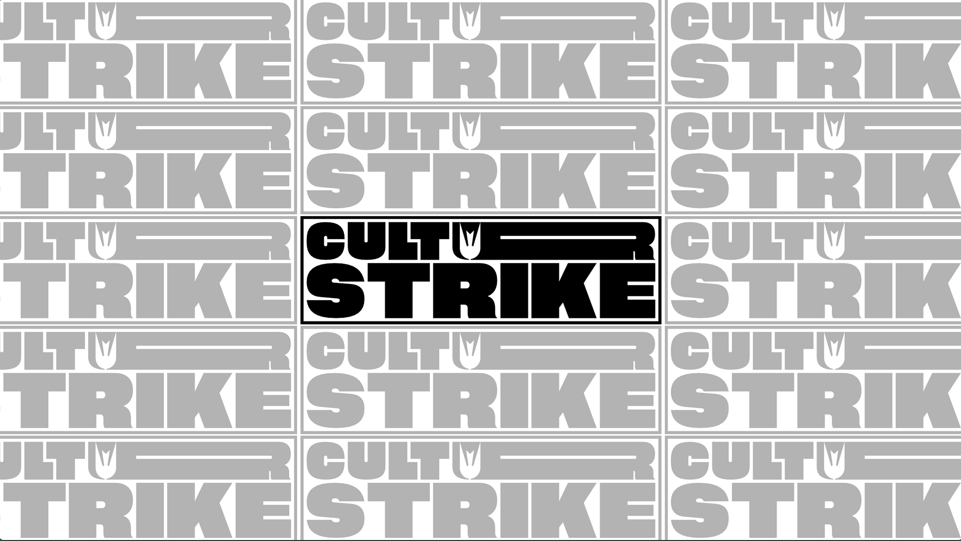
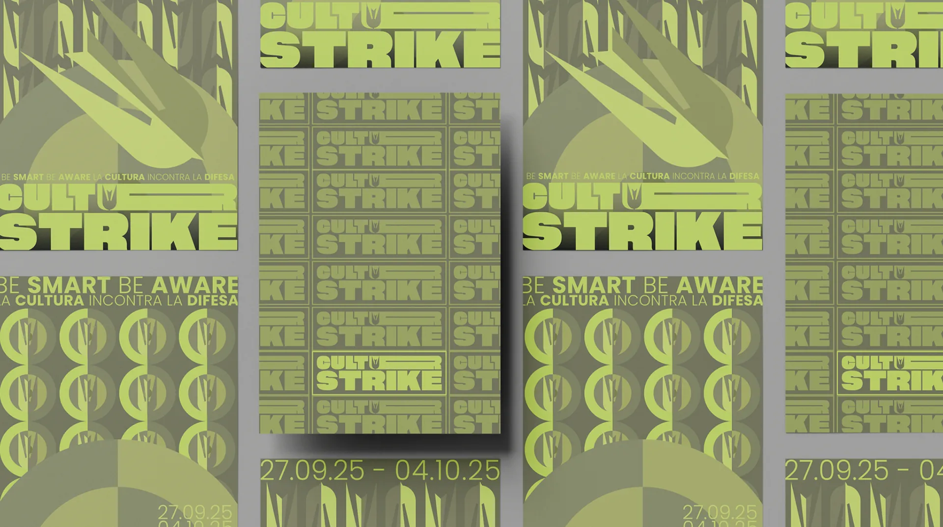
Culture Strike brand identity board 01
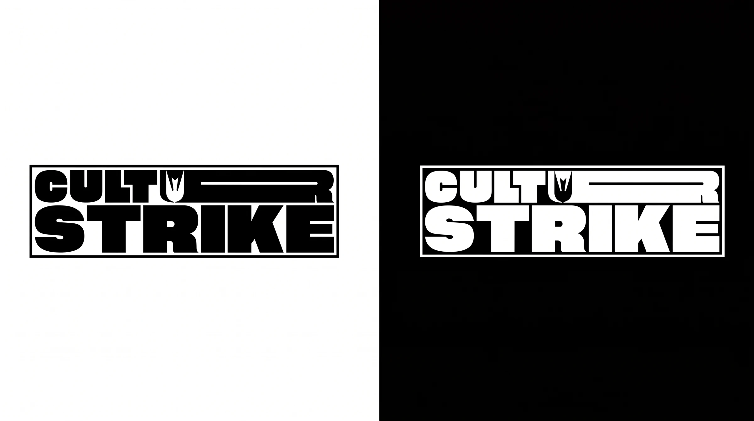
Culture Strike brand identity board 02
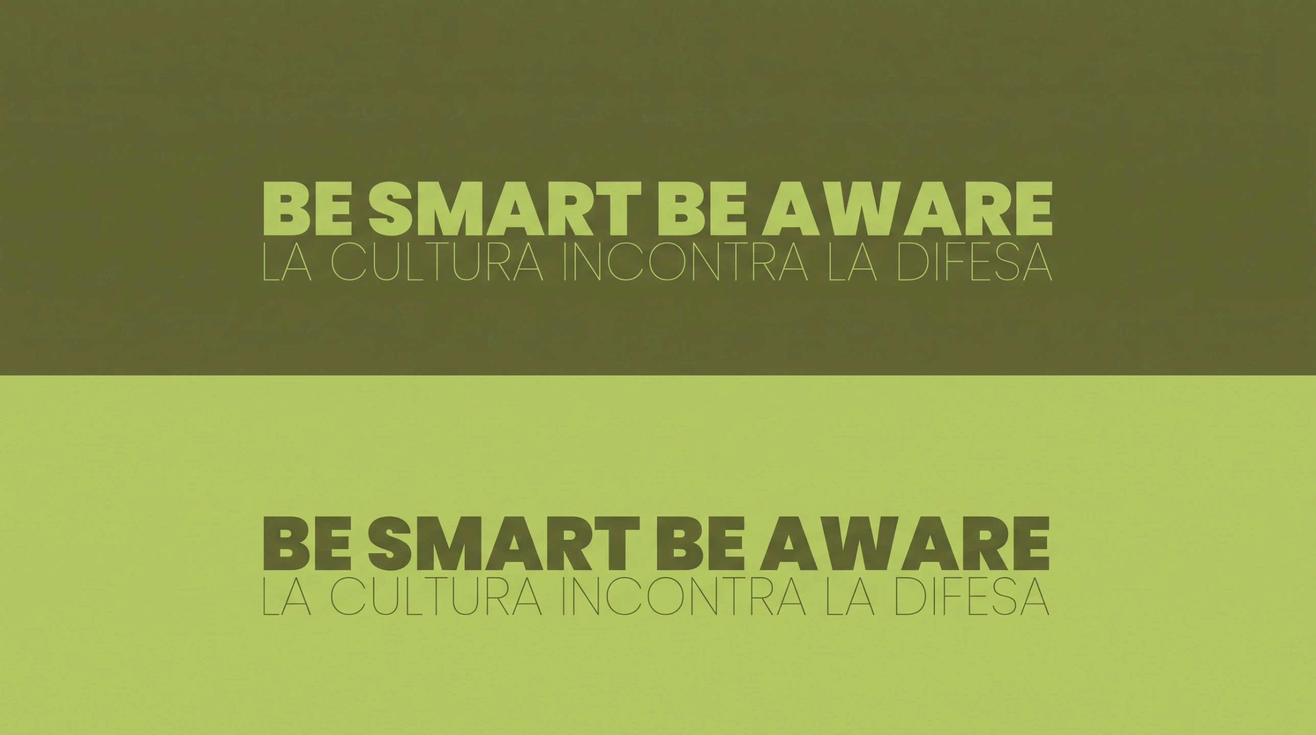
Culture Strike payoff — Be smart be aware
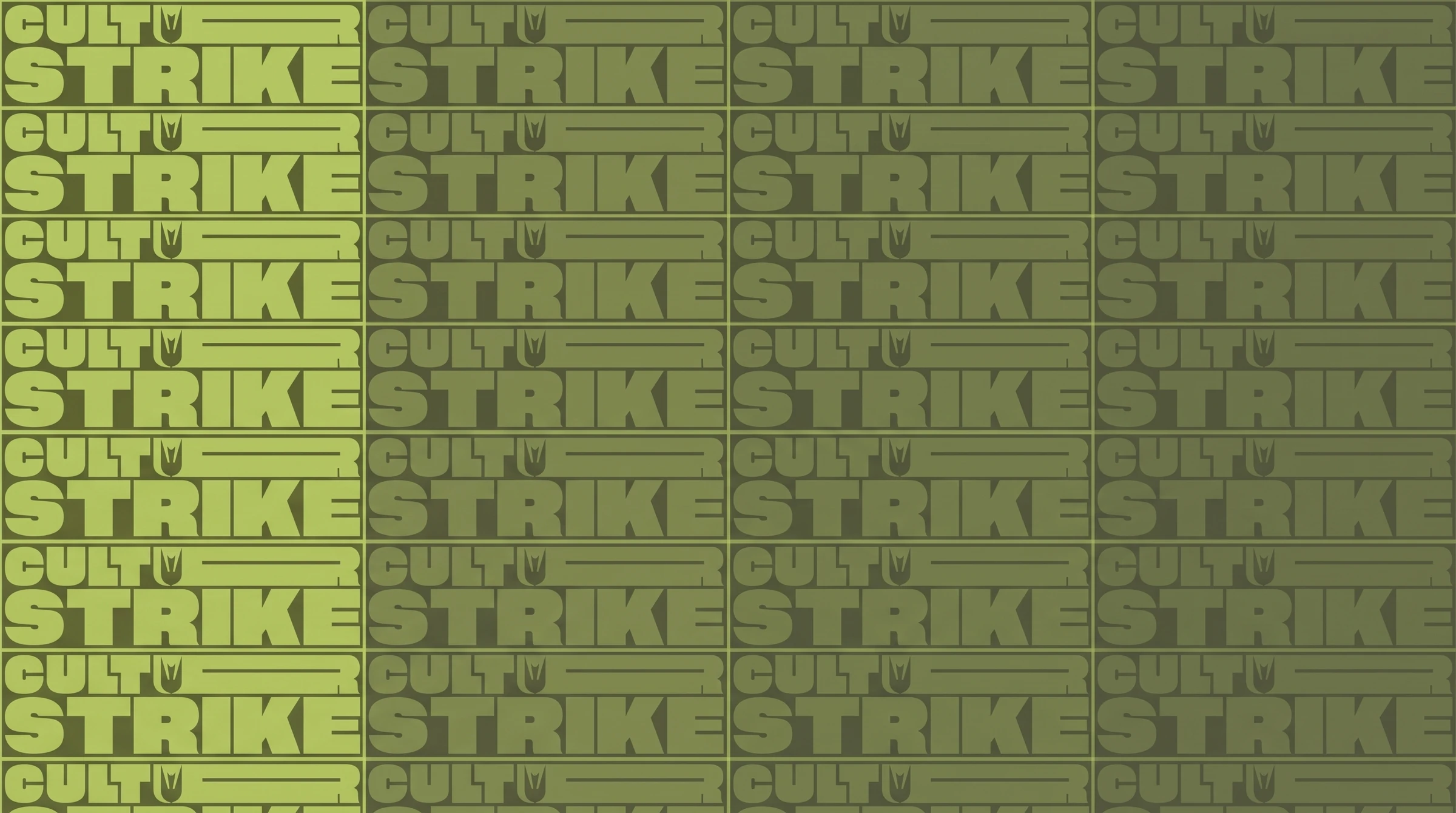
Culture Strike brand identity board 03
Culture Strike brand identity board 04
Culture Strike brand identity board 05
Culture Strike brand identity board 06
Culture Strike brand identity board 07
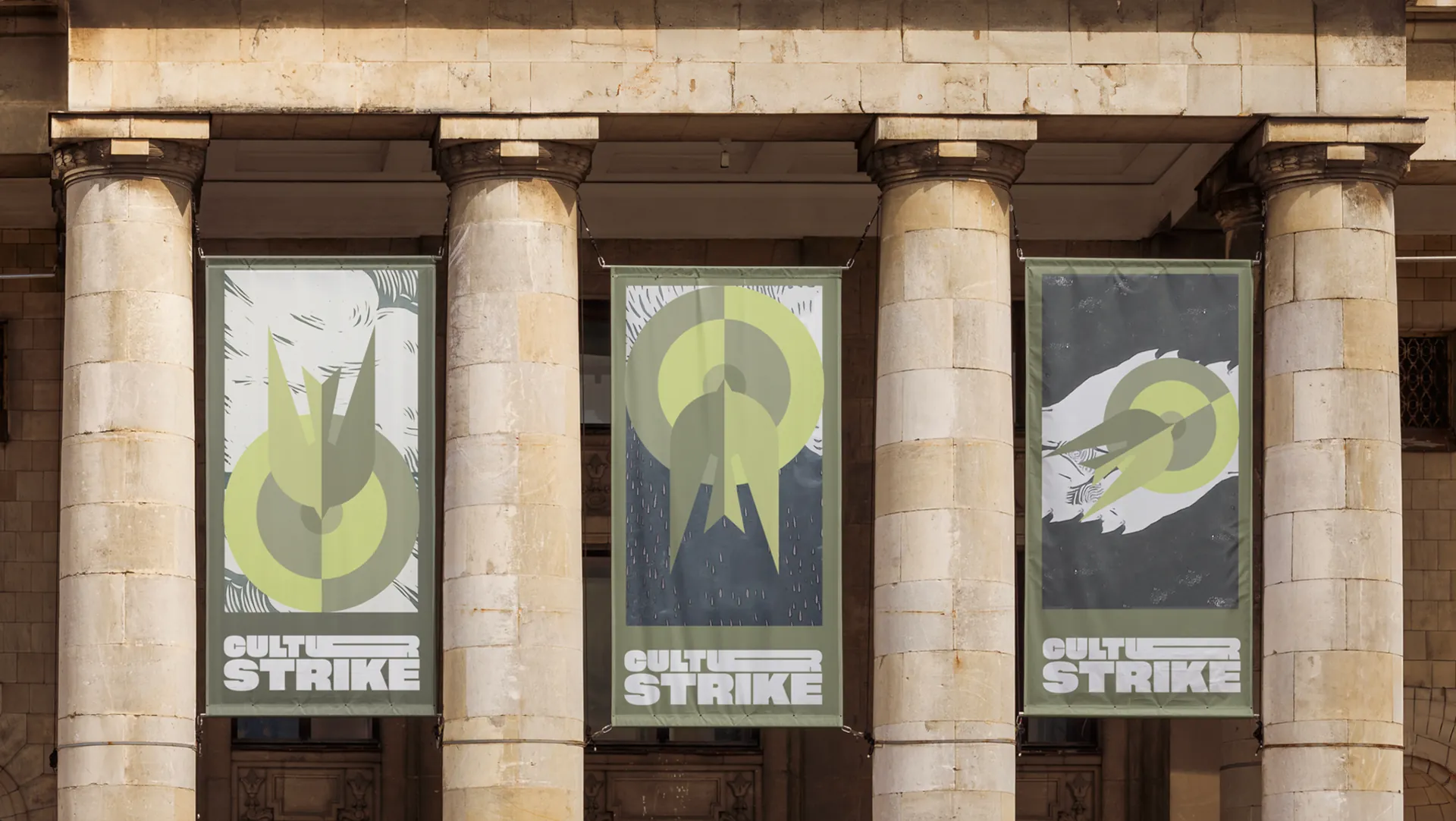
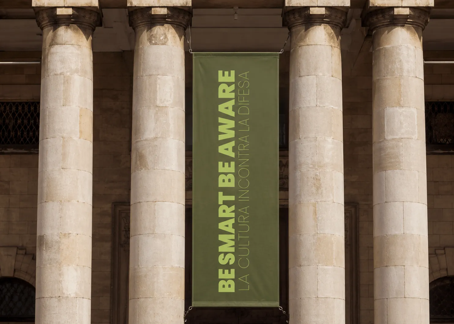
Culture Strike urban banners
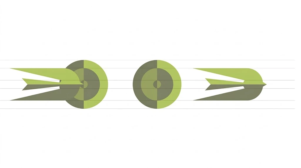
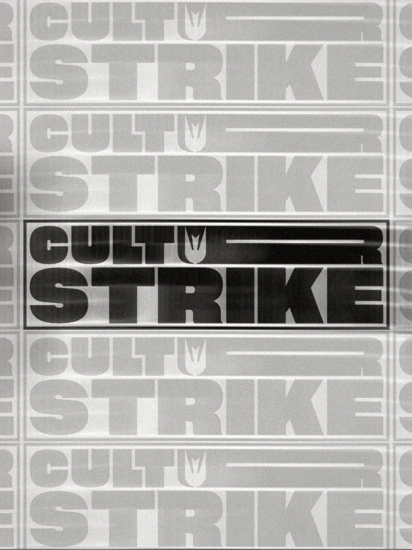
Culture Strike logo system
Culture Strike payoff system
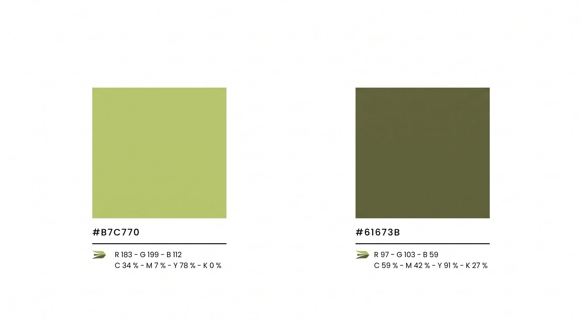
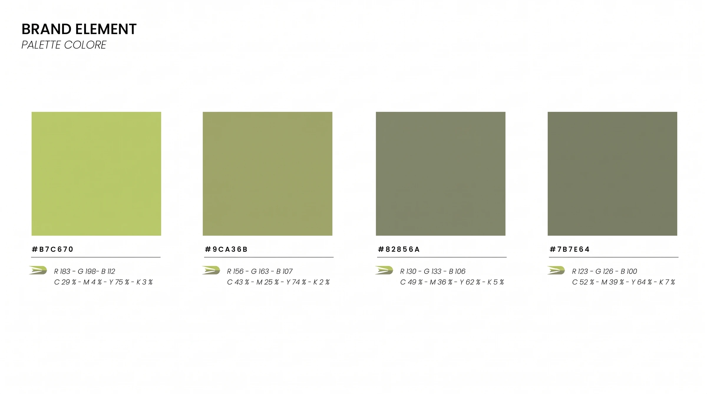
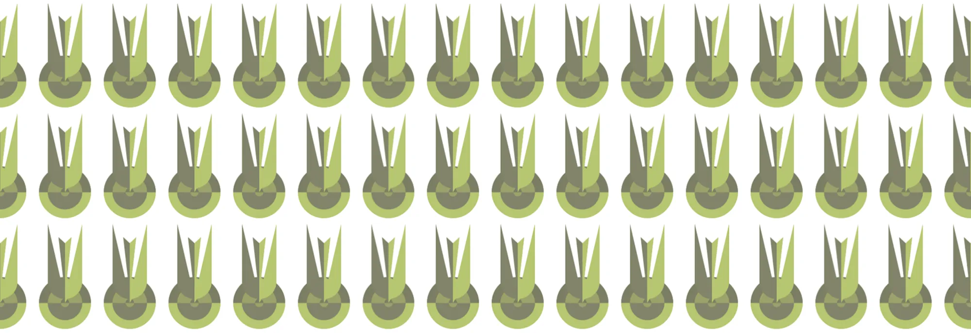
Culture Strike brand elements
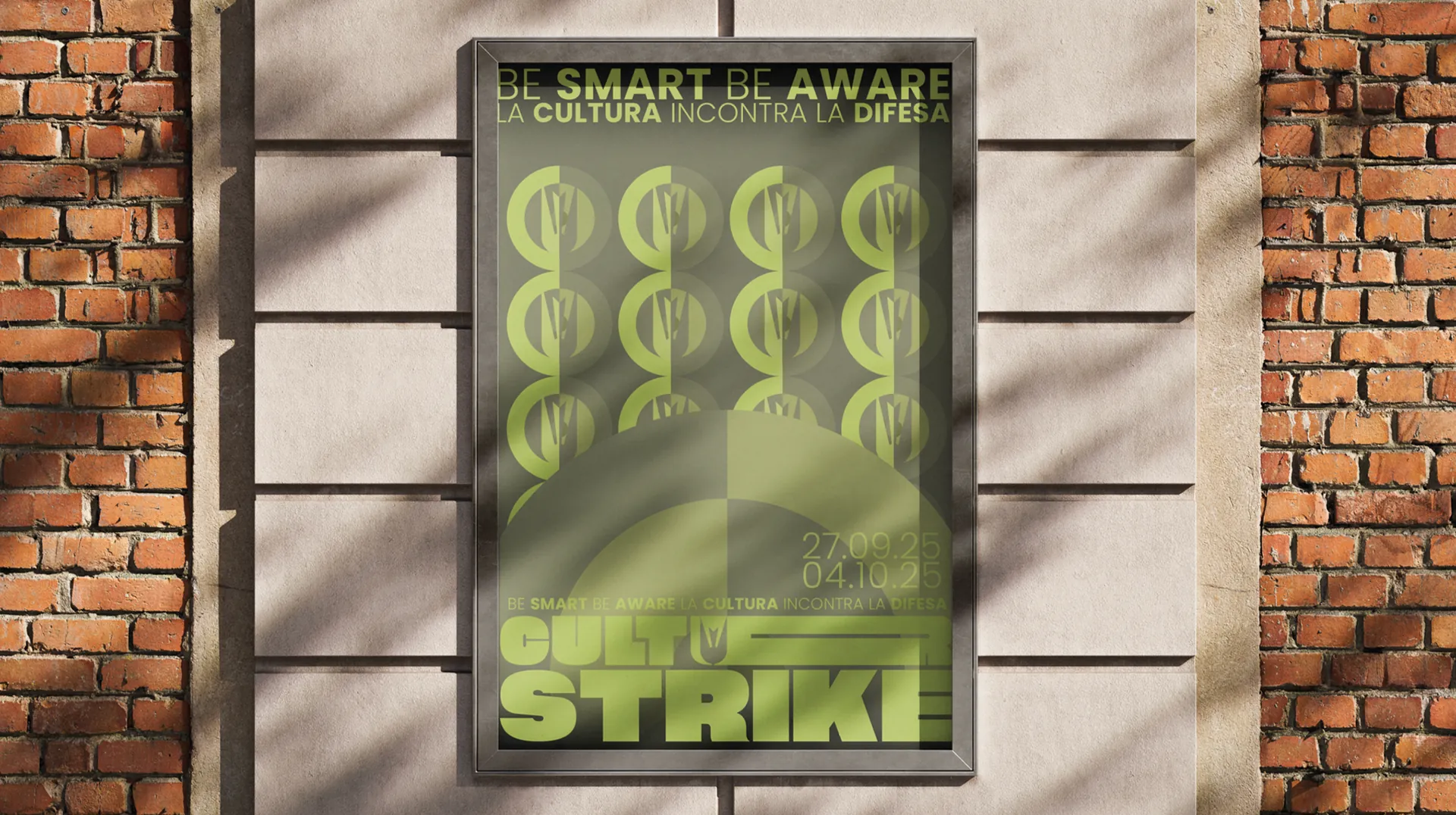
Culture Strike poster applicationCulture Strike campaign system
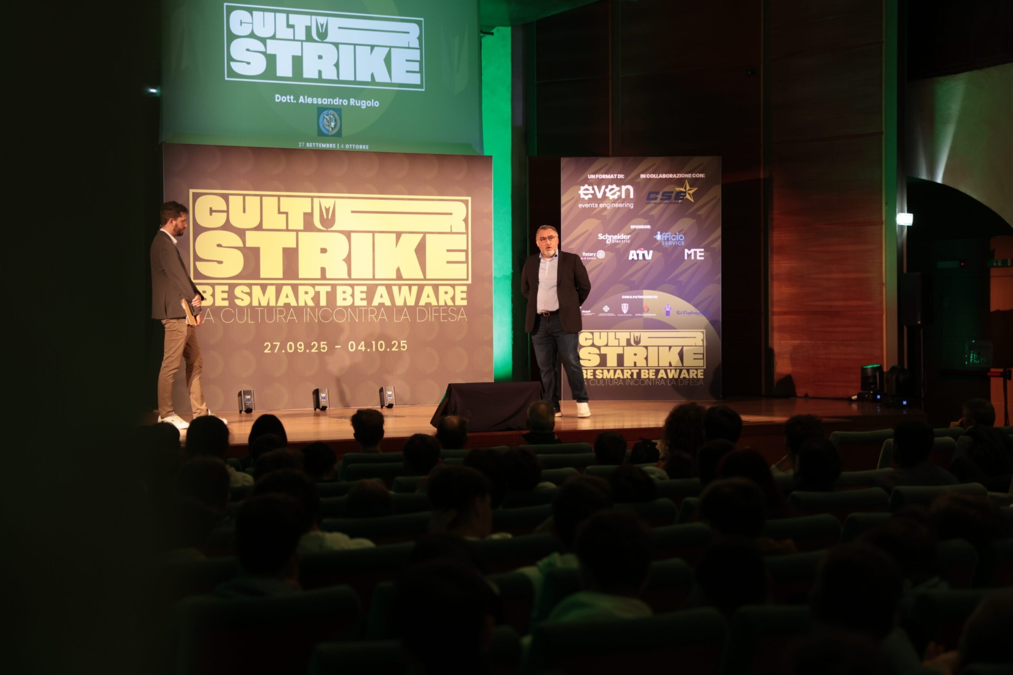
Culture Strike event stage
Overview

A cultural identity built like a manifesto, designed to work across city, stage and communication.

A compressed wordmark, a modular symbol of protection and awareness, a restricted green palette and the payoff “Be smart, be aware” form a system that repeats into patterns and rhythms. It scales from posters to banners and stage screens, behaving like a flexible system rather than a single event logo.

05

VIP Tennis Cup

Building a complete brand experience for an international tennis event in Sardinia.

Scope

Event Identity
Environmental Graphics
Digital Design
Presentation Design

Year

2026

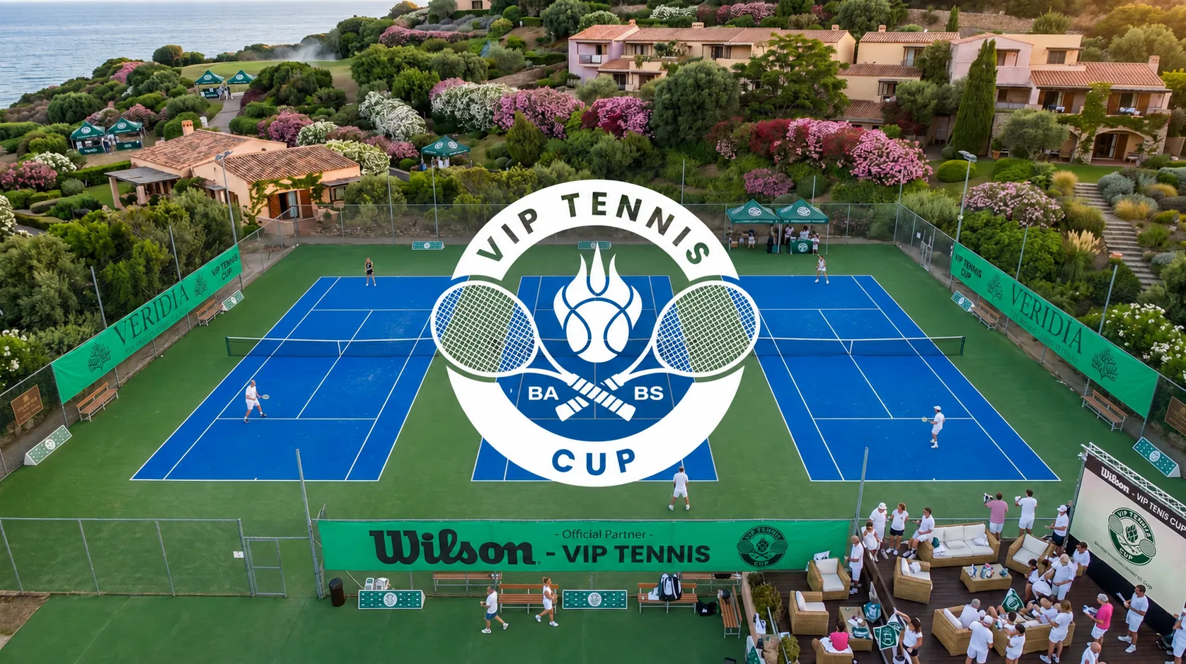
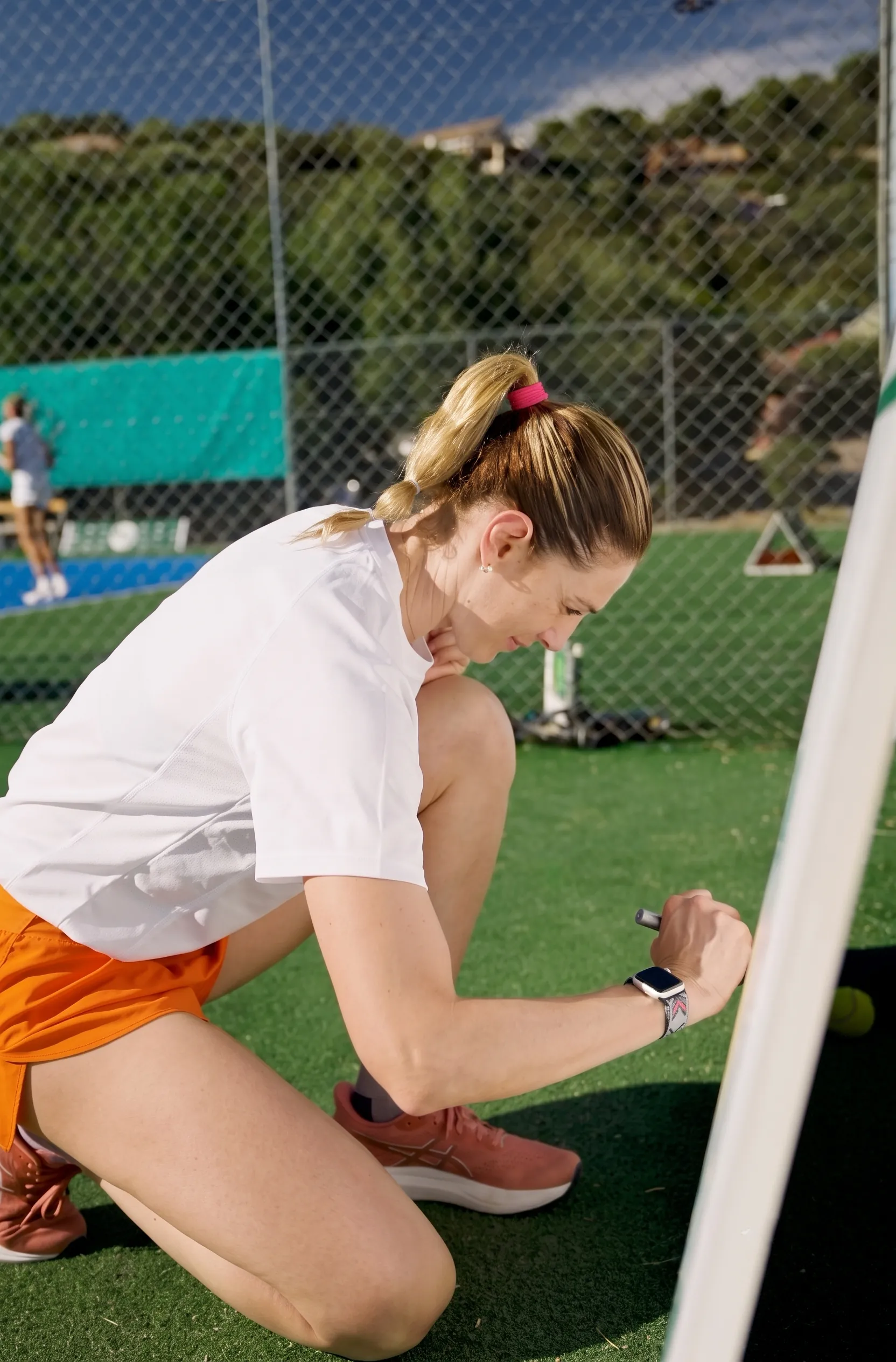
VIP Tennis Cup aerial court view
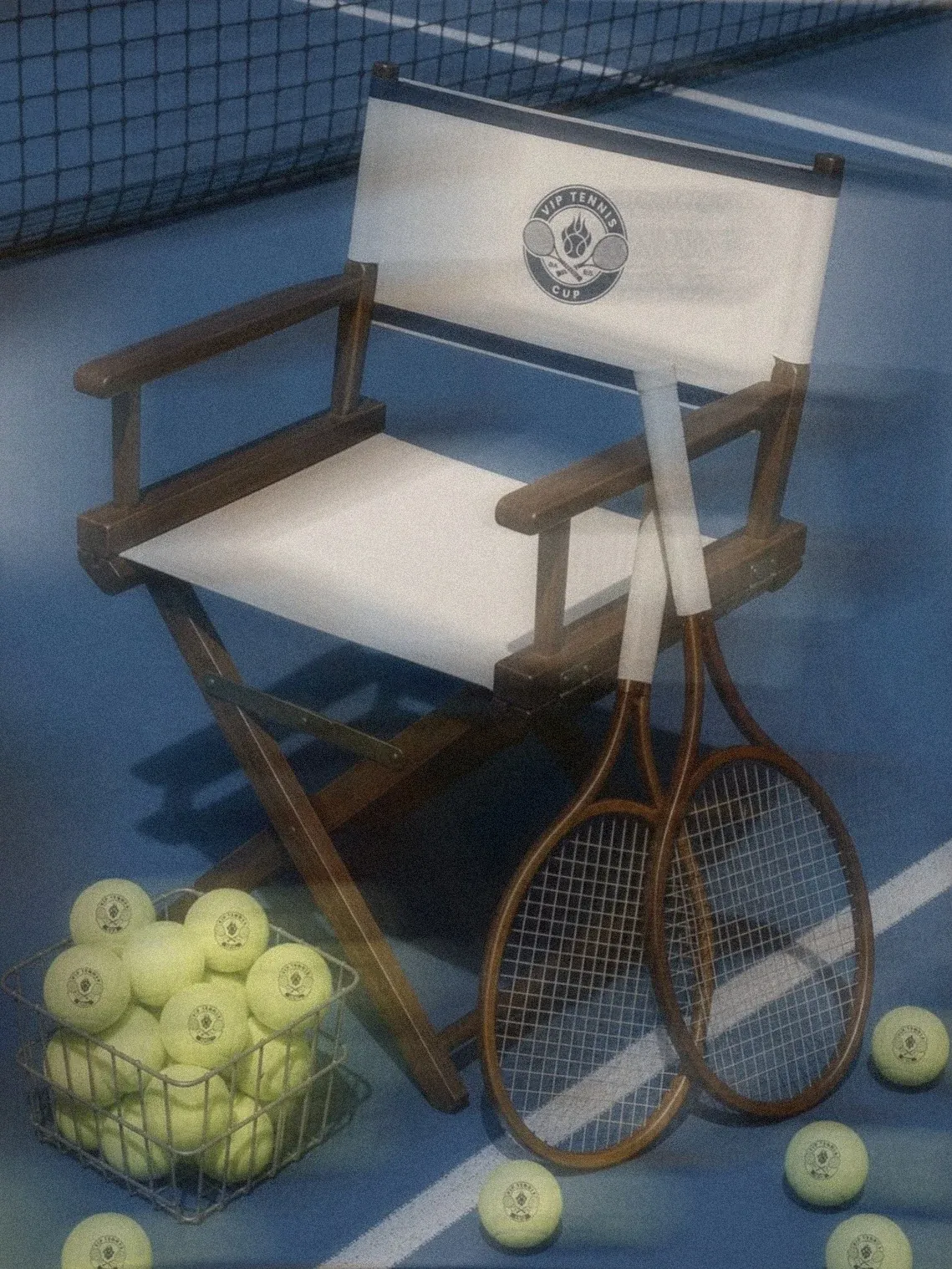
VIP Tennis Cup logo
VIP Tennis Cup court drone view
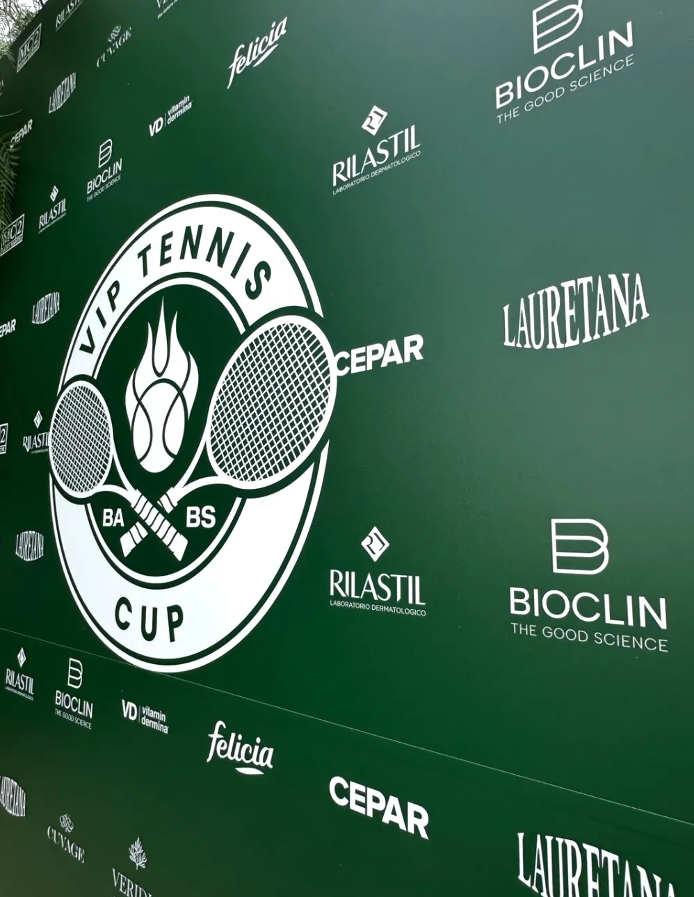
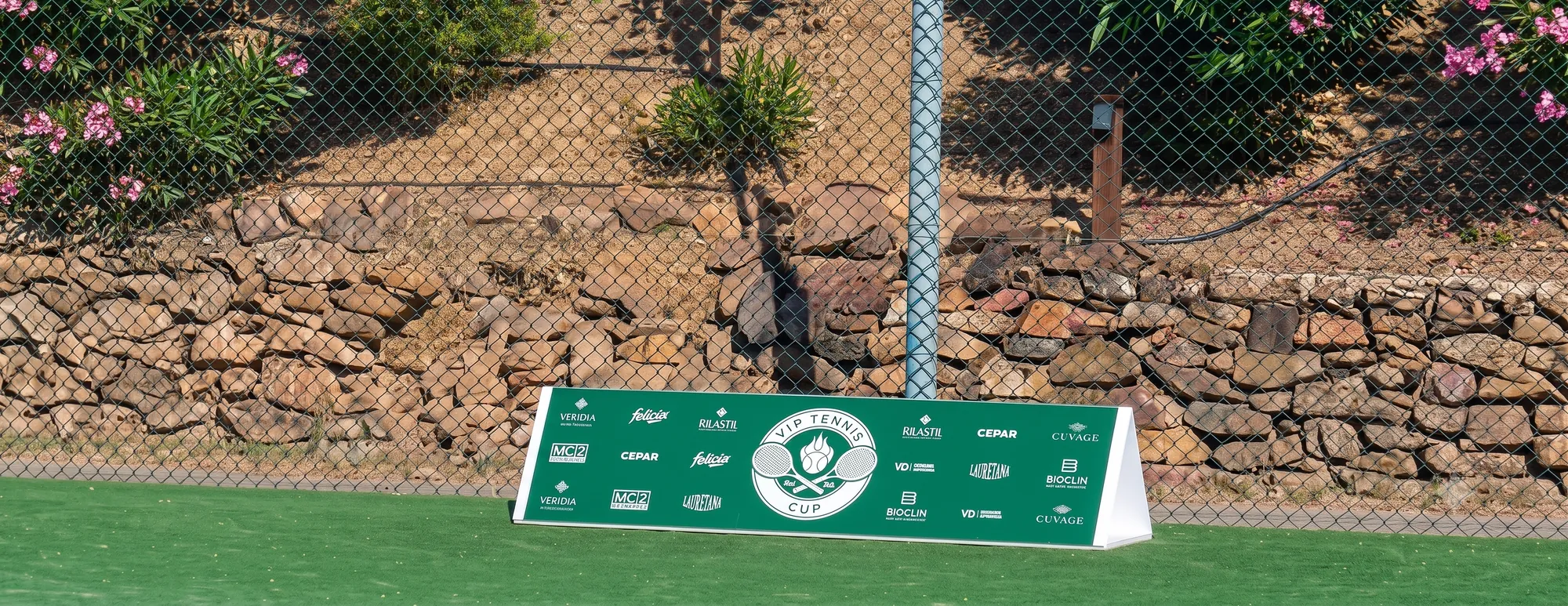
VIP Tennis Cup sponsor backdropVIP Tennis Cup court signage
Overview

A complete brand experience for an international tennis tournament in Sardinia.

A classic sporting badge with a flame-like central mark anchors the identity. It extends across digital communication, courts, backdrops, signage and sponsor visibility, so sport, hospitality and partners live in one recognisable system: in motion, in space and in photography.

06

Nesta House

A modular identity and digital experience for contemporary hospitality.

Scope

Brand Strategy
Logo & Identity
UX/UI Design
Digital Product

Year

2025–2026

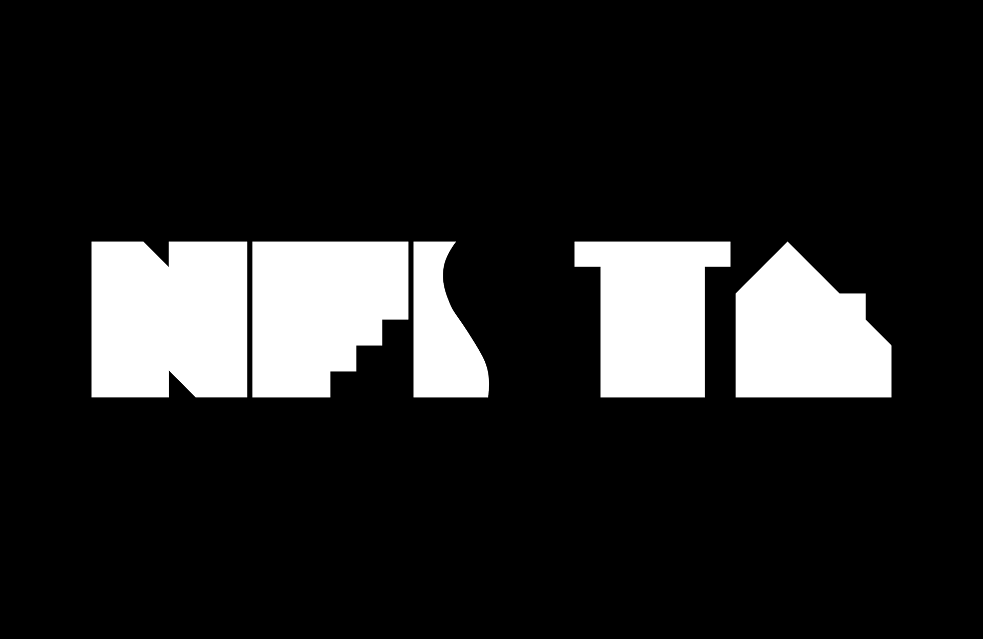
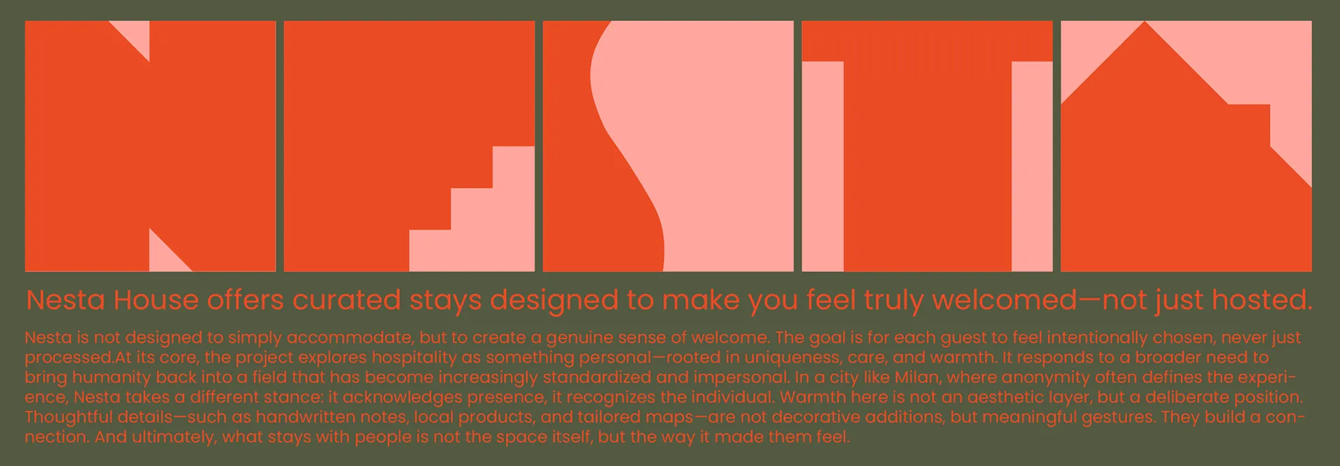
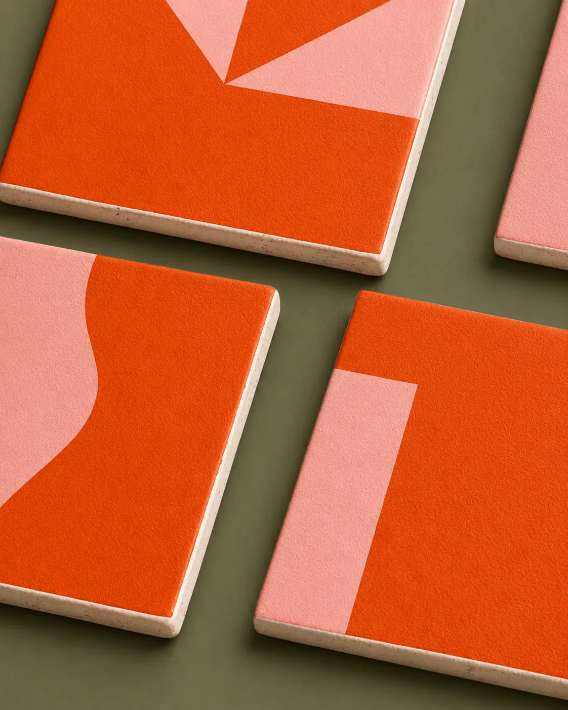
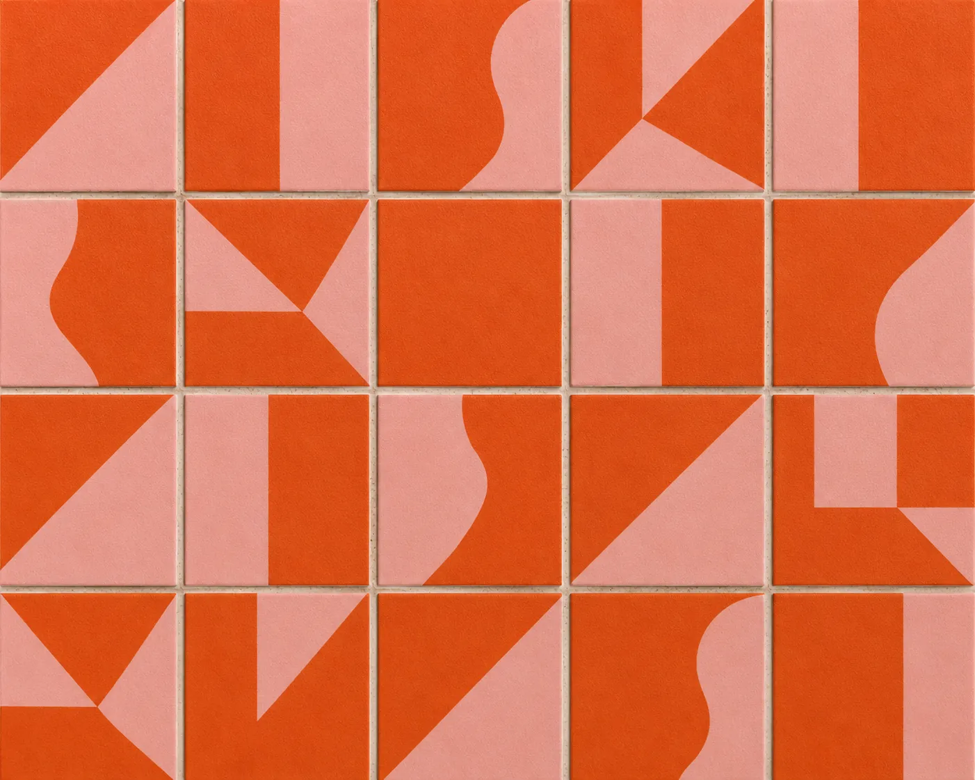
Nesta House modular system
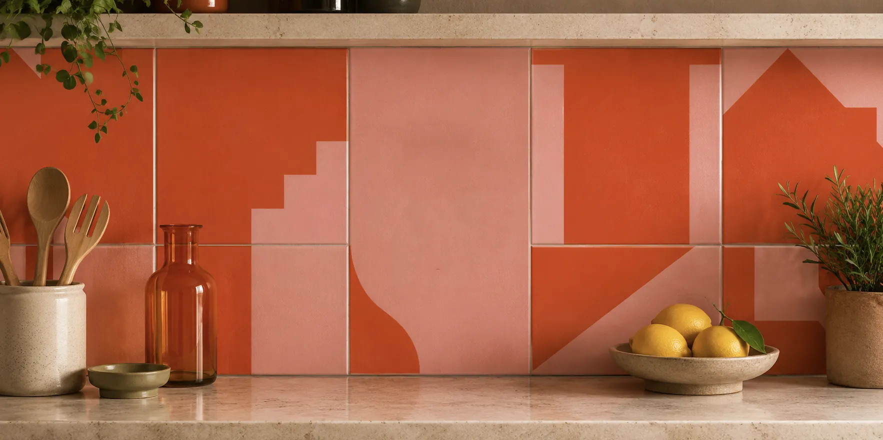
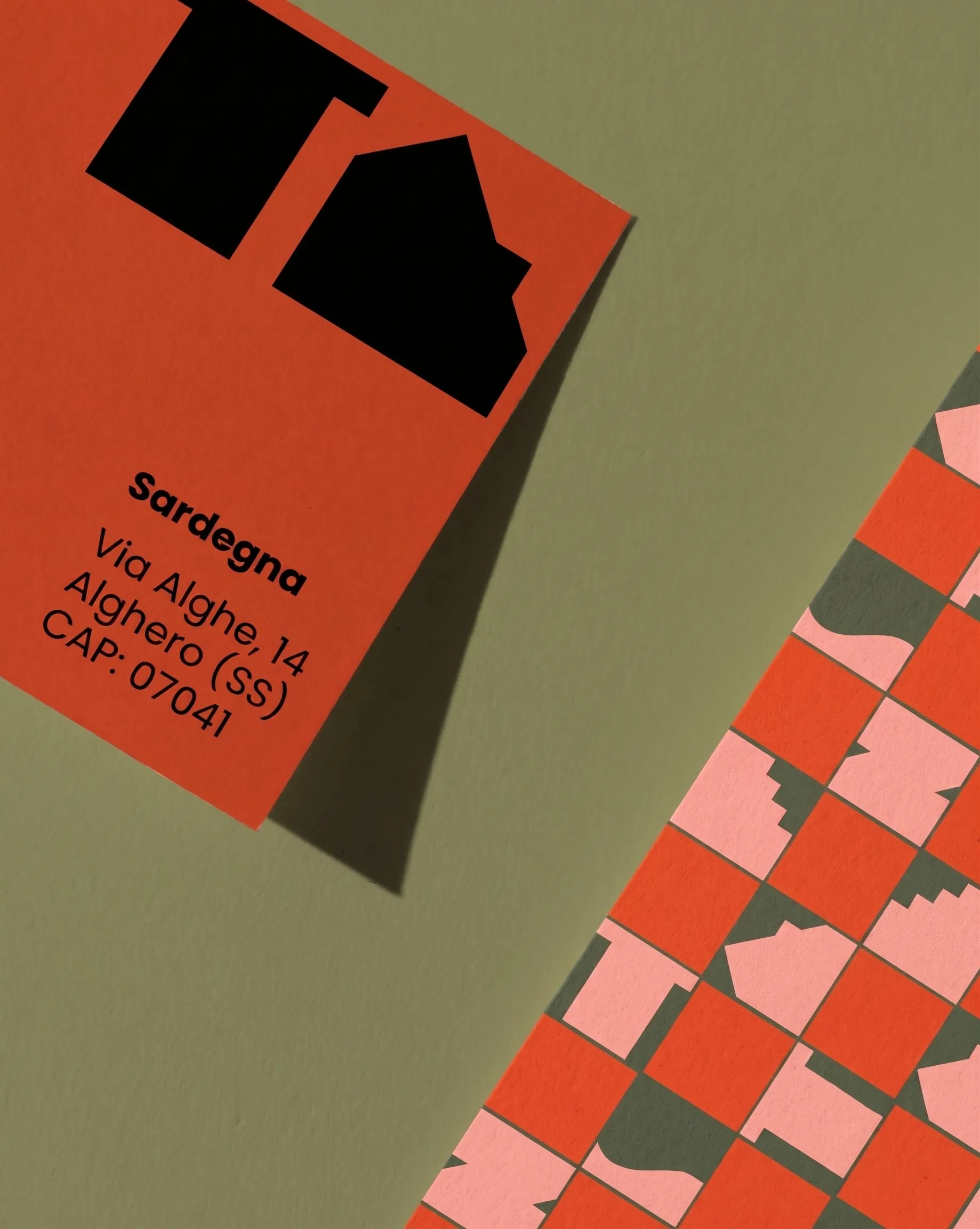
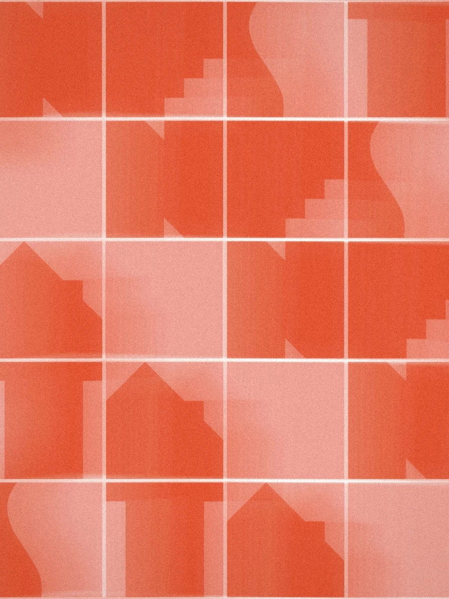
Nesta House pattern system
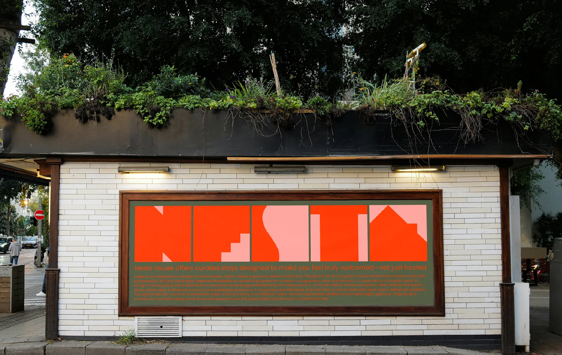
Nesta House outdoor application
Nesta House about pageNesta House Milan pageNesta House Sardinia pageNesta House property page
Overview

A modular identity and digital experience for hospitality where guests feel truly welcomed, not just hosted.

The logo becomes a system of rooms, paths and thresholds whose forms recombine into patterns and compositions. The same modular grid drives the website, connecting brand story, destinations, homes and local activities: an end-to-end experience designed to grow with new places and stories.
07

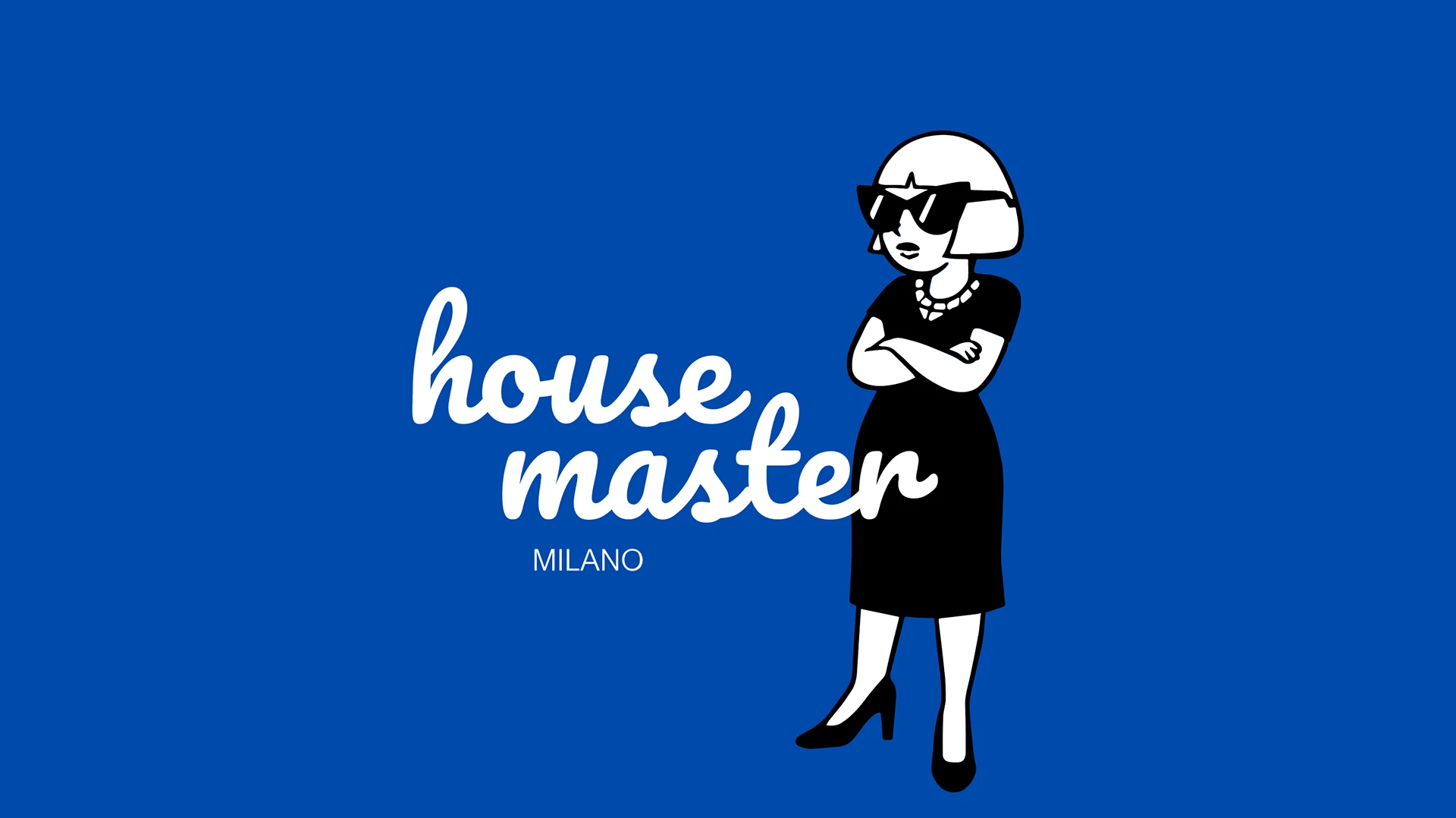
House Master

A bold, ironic identity for a home care service in Milan.

Scope

Brand Identity
Logo Design
Character Design
Print & Promo

Year

2025

House Master — logo
House Master brand identity 08
House Master brand identity 07
House Master brand identity 06
House Master brand identity 05
House Master brand identity 04
House Master brand identity 02
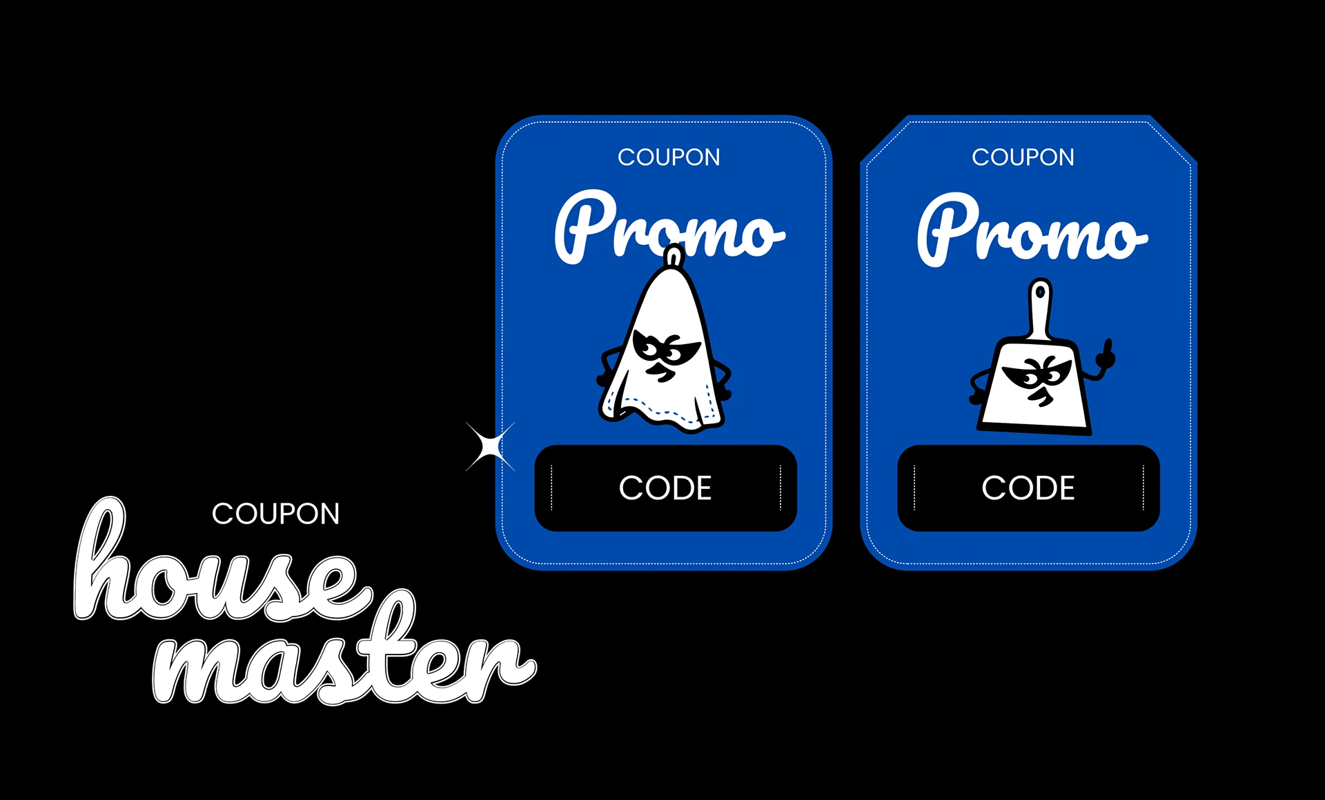
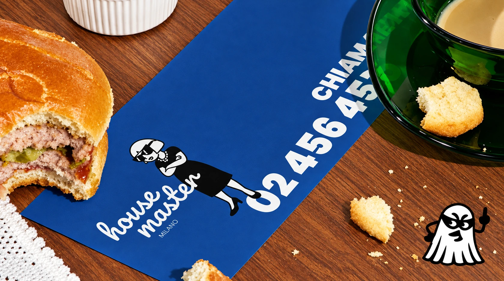
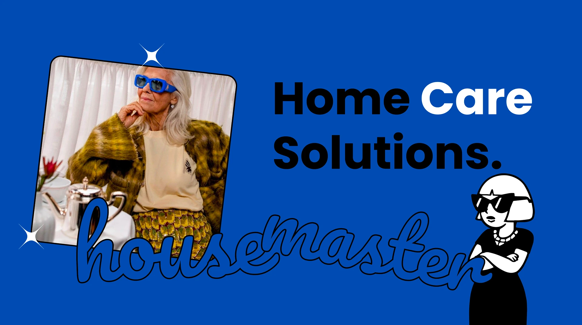
House Master — Home Care Solutions
Overview

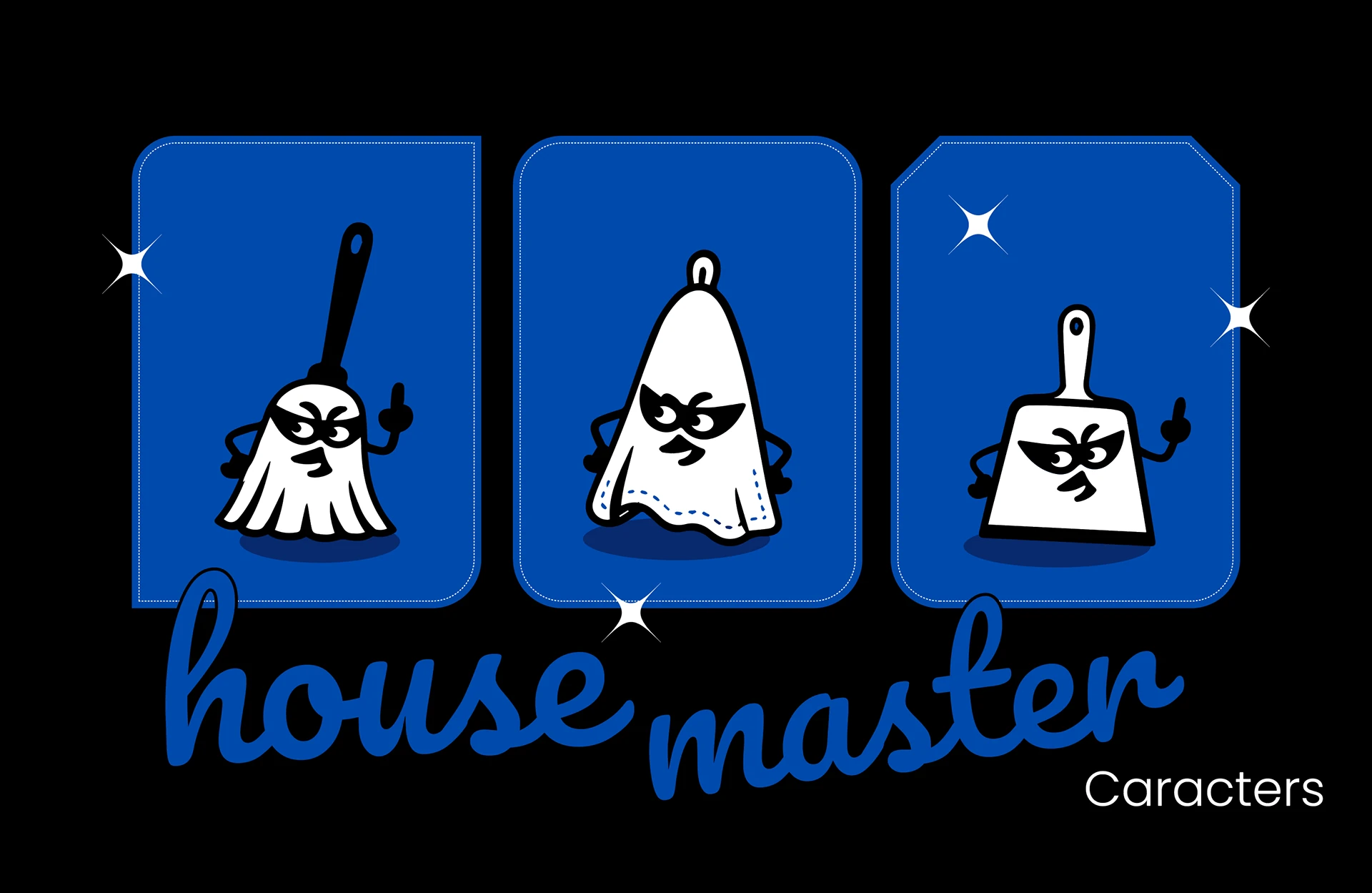
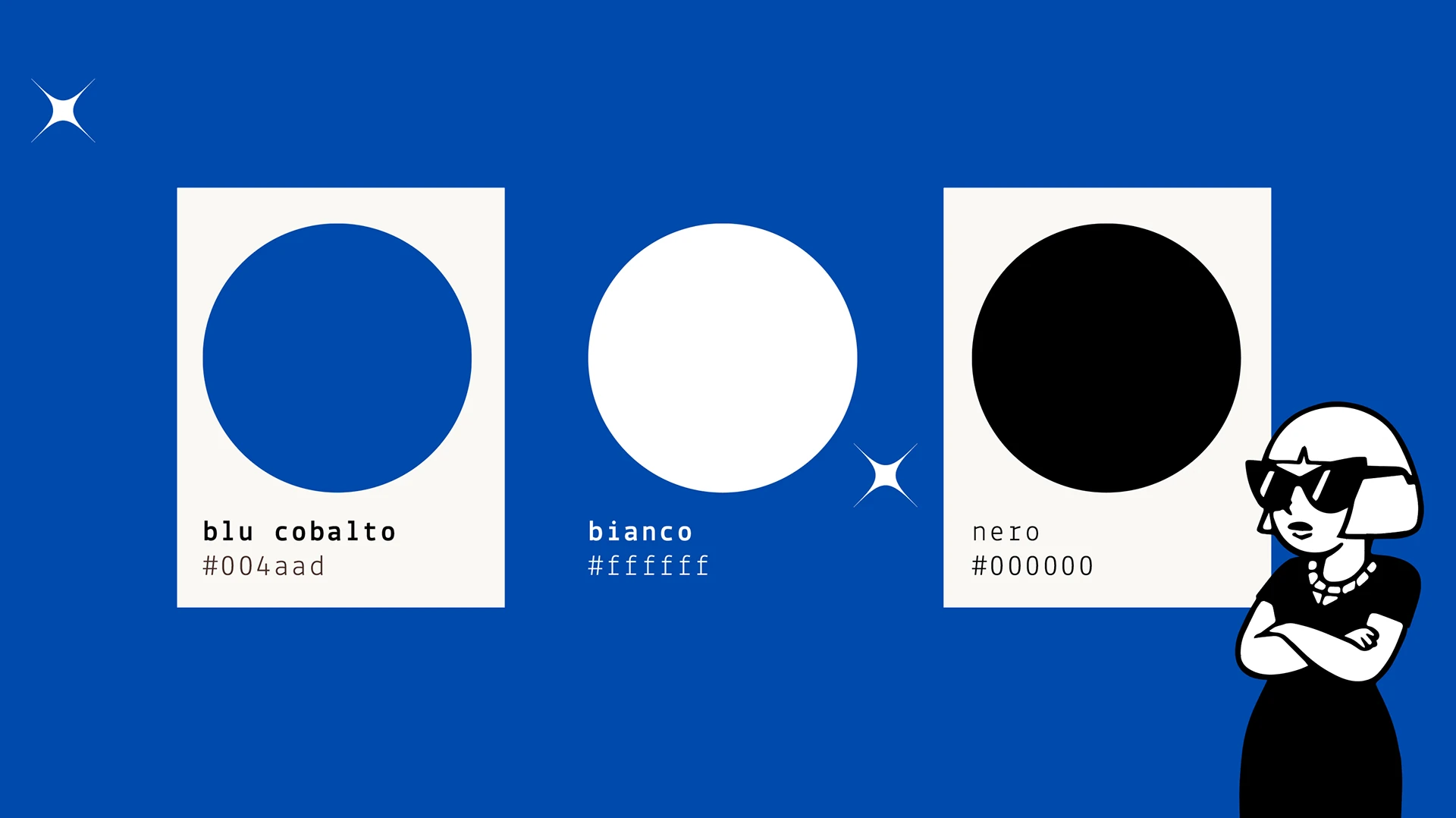
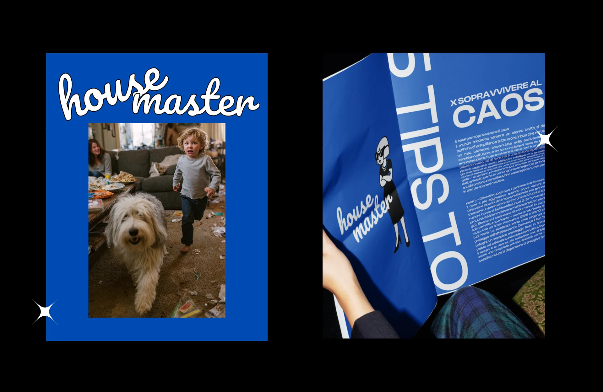
House Master turns home care into a character: confident, ironic and impossible to ignore.

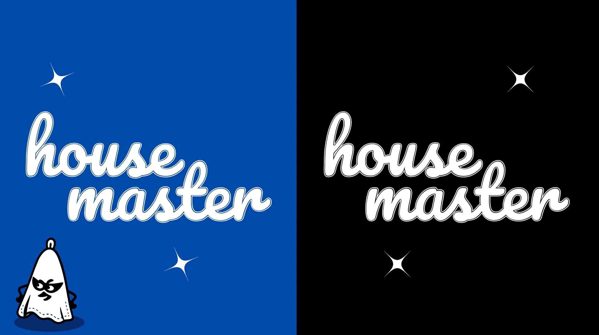
A script logotype, a single cobalt blue and a cast of illustrated characters, the house master and her masked cleaning tools, carry the brand across flyers, editorial content and promo coupons. Chaos, under control.

08

Bold Brew Coffee

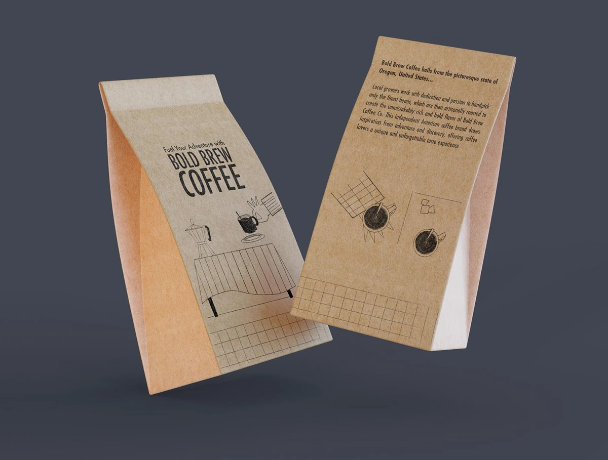
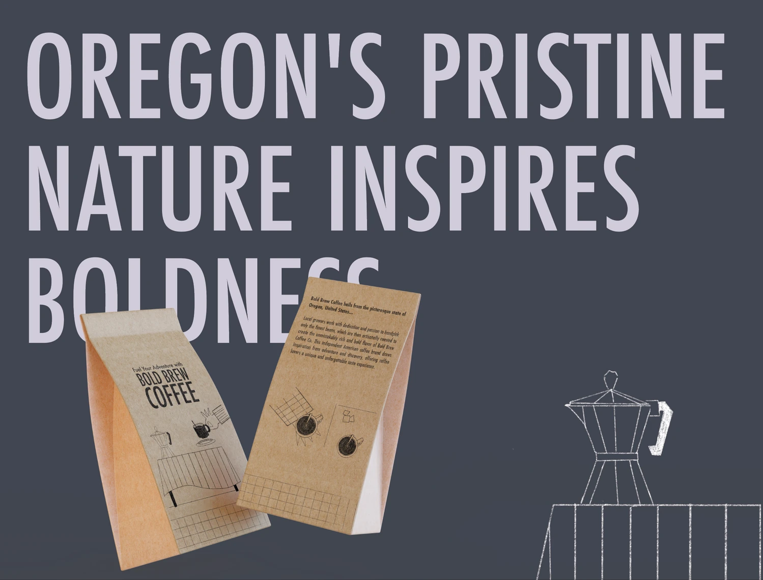
A hand-drawn identity and packaging for an independent coffee brand from Oregon.

Scope

Brand Identity
Illustration
Packaging
Communication

Year

2020

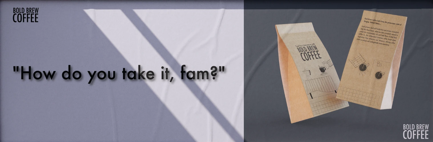
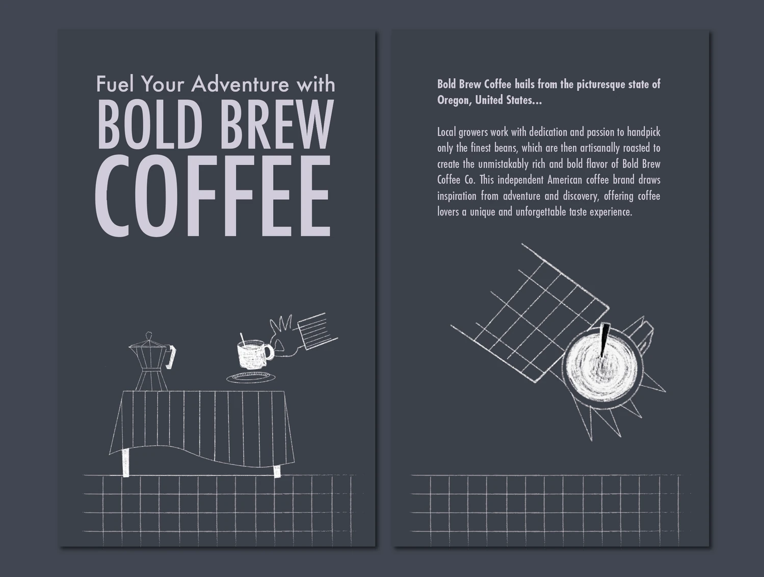
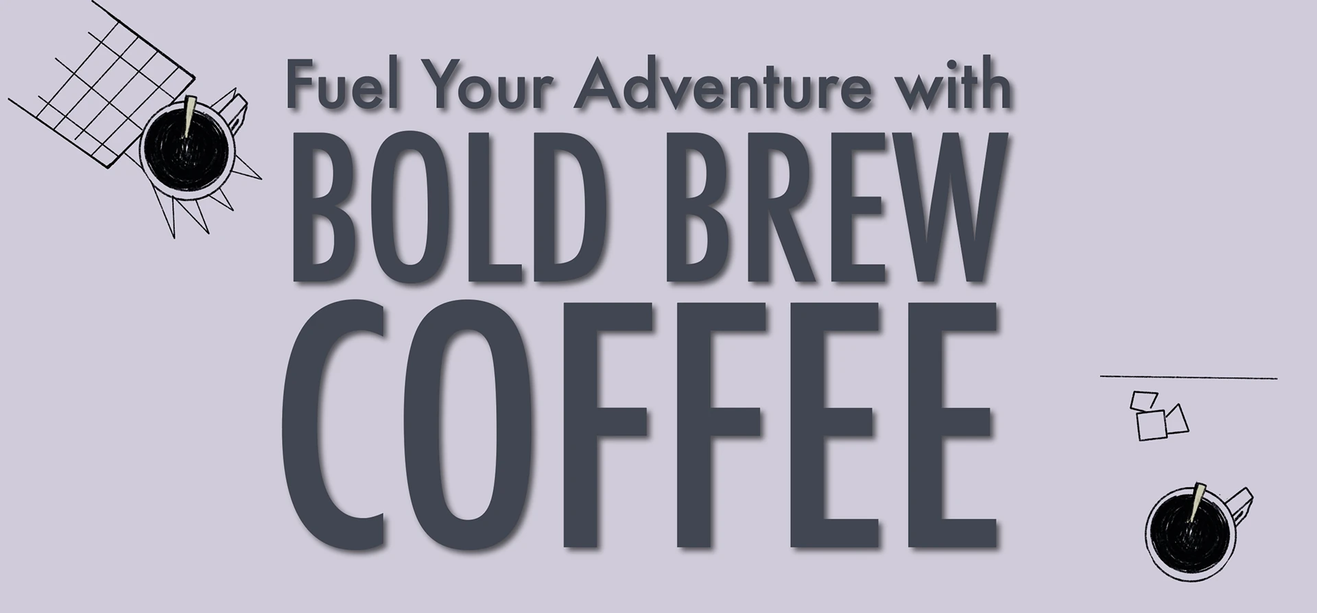
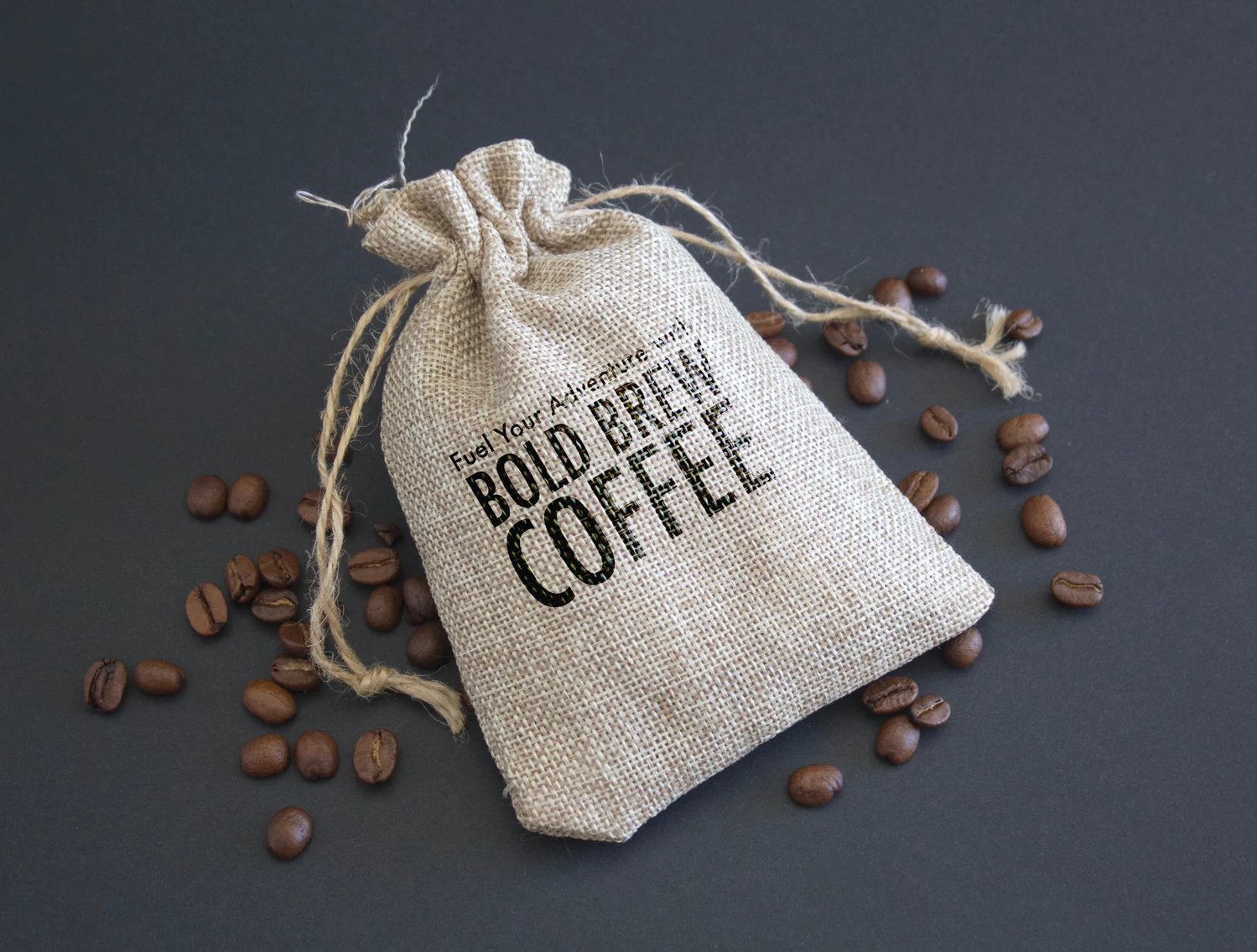
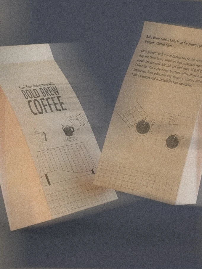
Bold Brew Coffee 11
Bold Brew Coffee 10
Bold Brew Coffee 09
Bold Brew Coffee 08
Bold Brew Coffee 07
Bold Brew Coffee 06
Bold Brew Coffee 02
Bold Brew Coffee 01
Bold Brew Coffee 04
Overview

Bold Brew Coffee brings the spirit of adventure to the everyday coffee ritual.

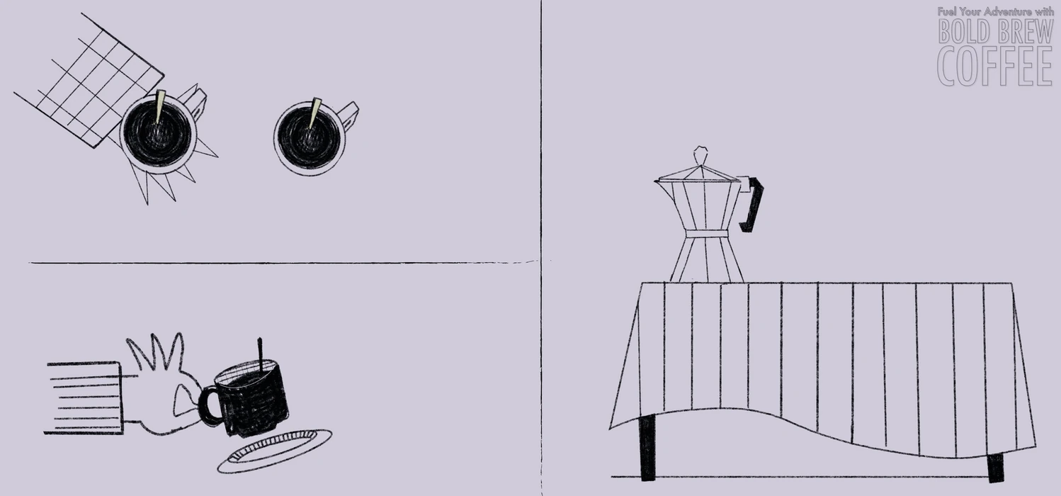
Hand-drawn cups, moka pots and grids give the brand a warm, personal voice against a bold condensed logotype. A soft palette of lavender, slate and black runs across kraft packaging, postcards, posters and social content. Fuel your adventure.

09

35 MM Film Festival

Rebranding a young film festival for its second edition.

Scope

Rebranding
Logo Design
Social Media
Event Materials

Year

2025

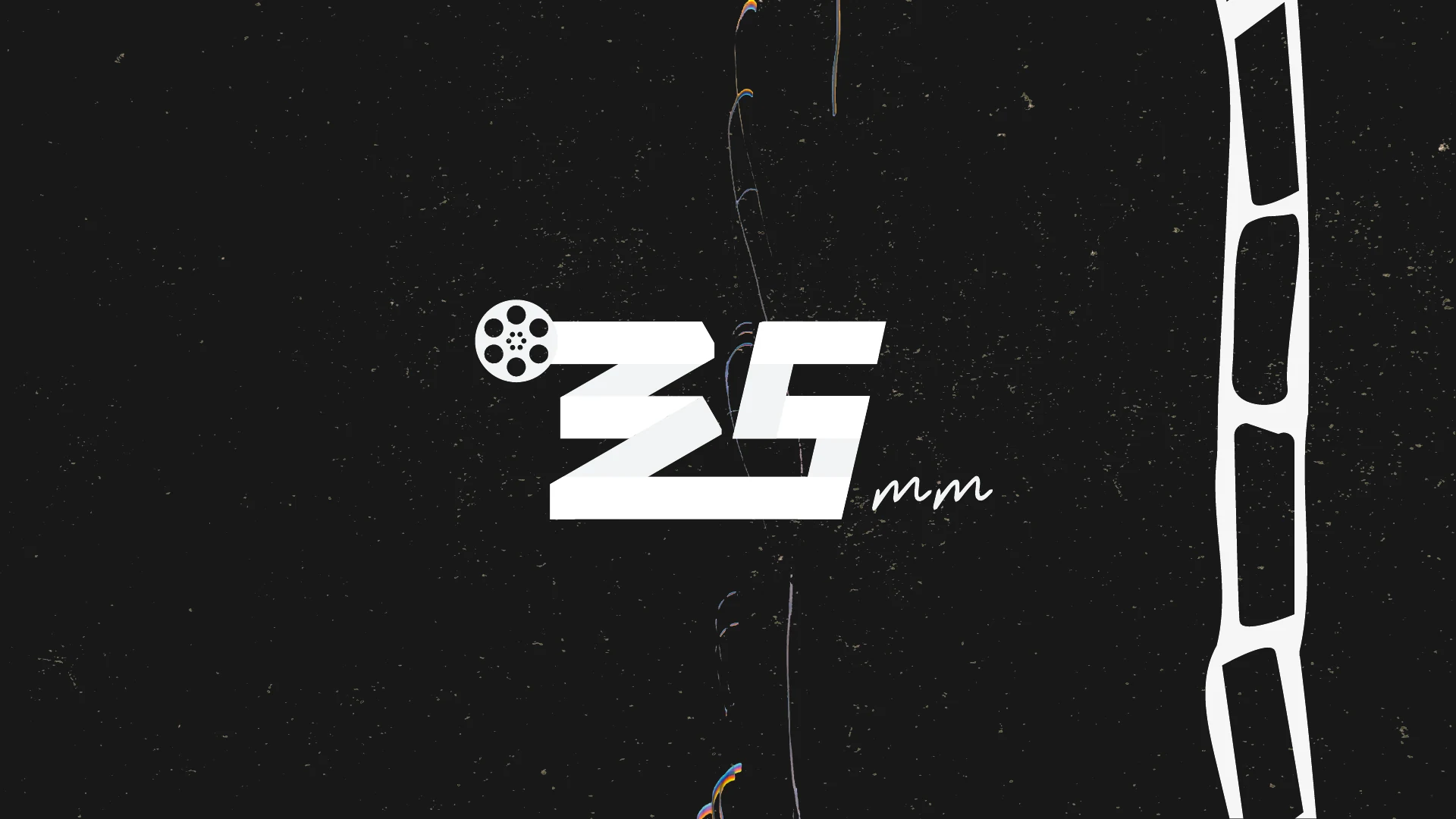
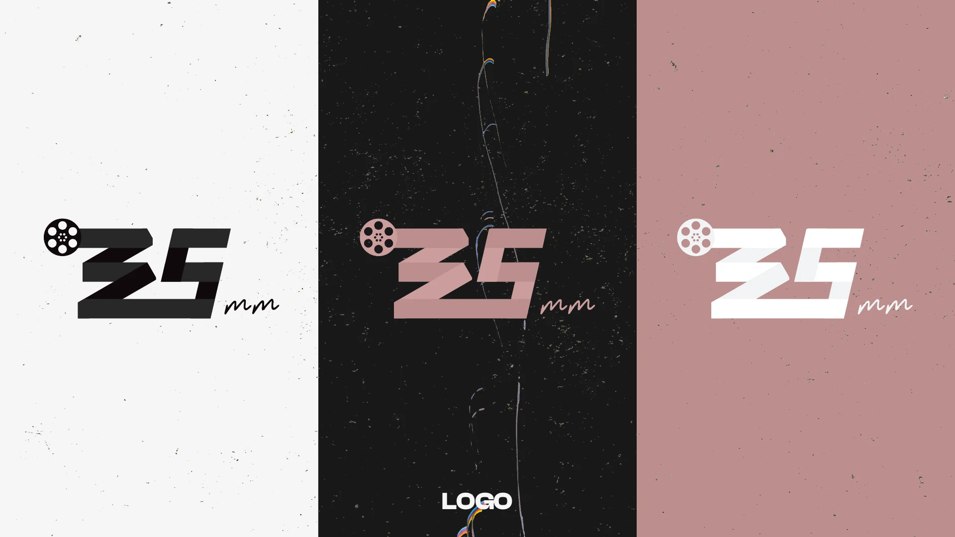
35 MM Film Festival — new logo
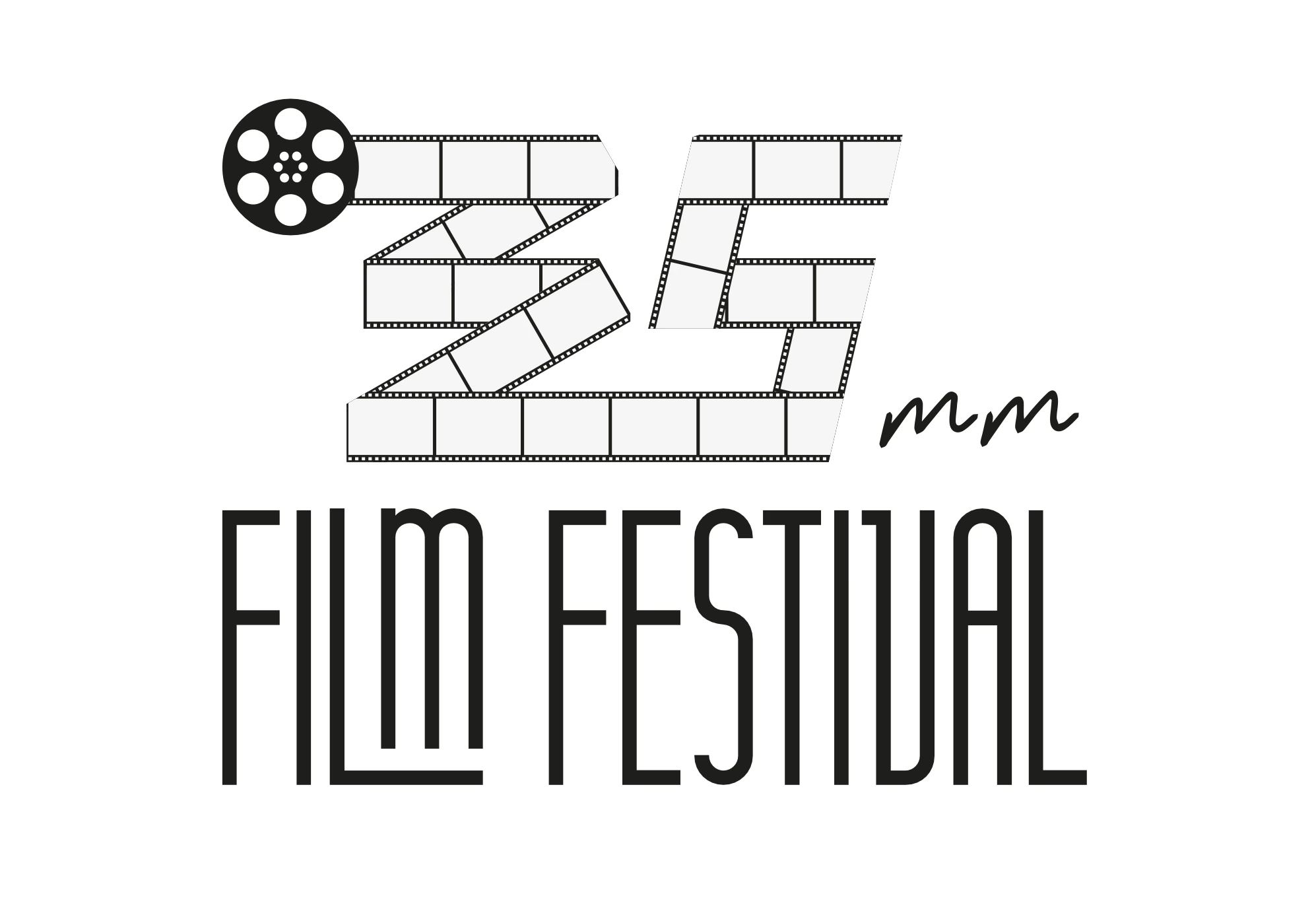
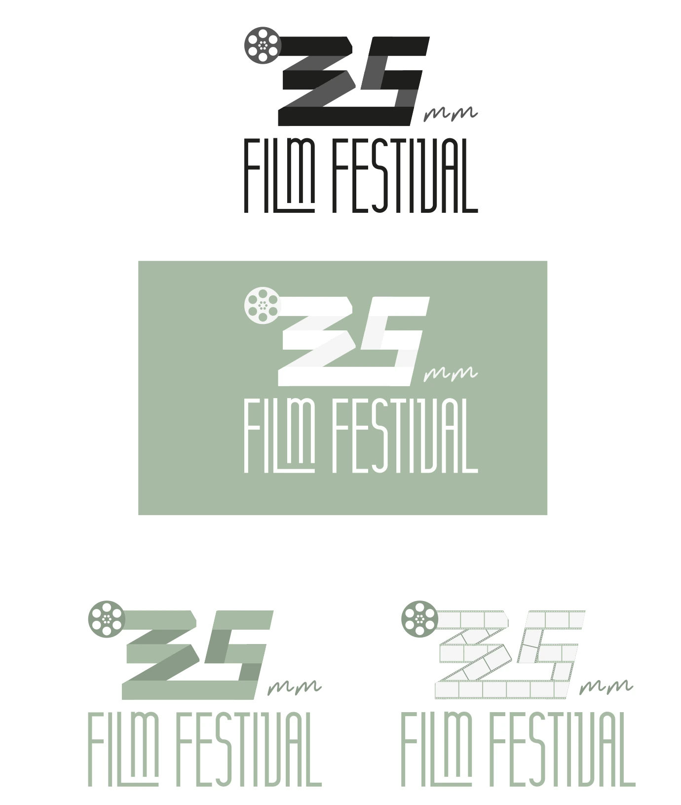
35 MM Film Festival — previous logo35 MM Film Festival — previous logo versions
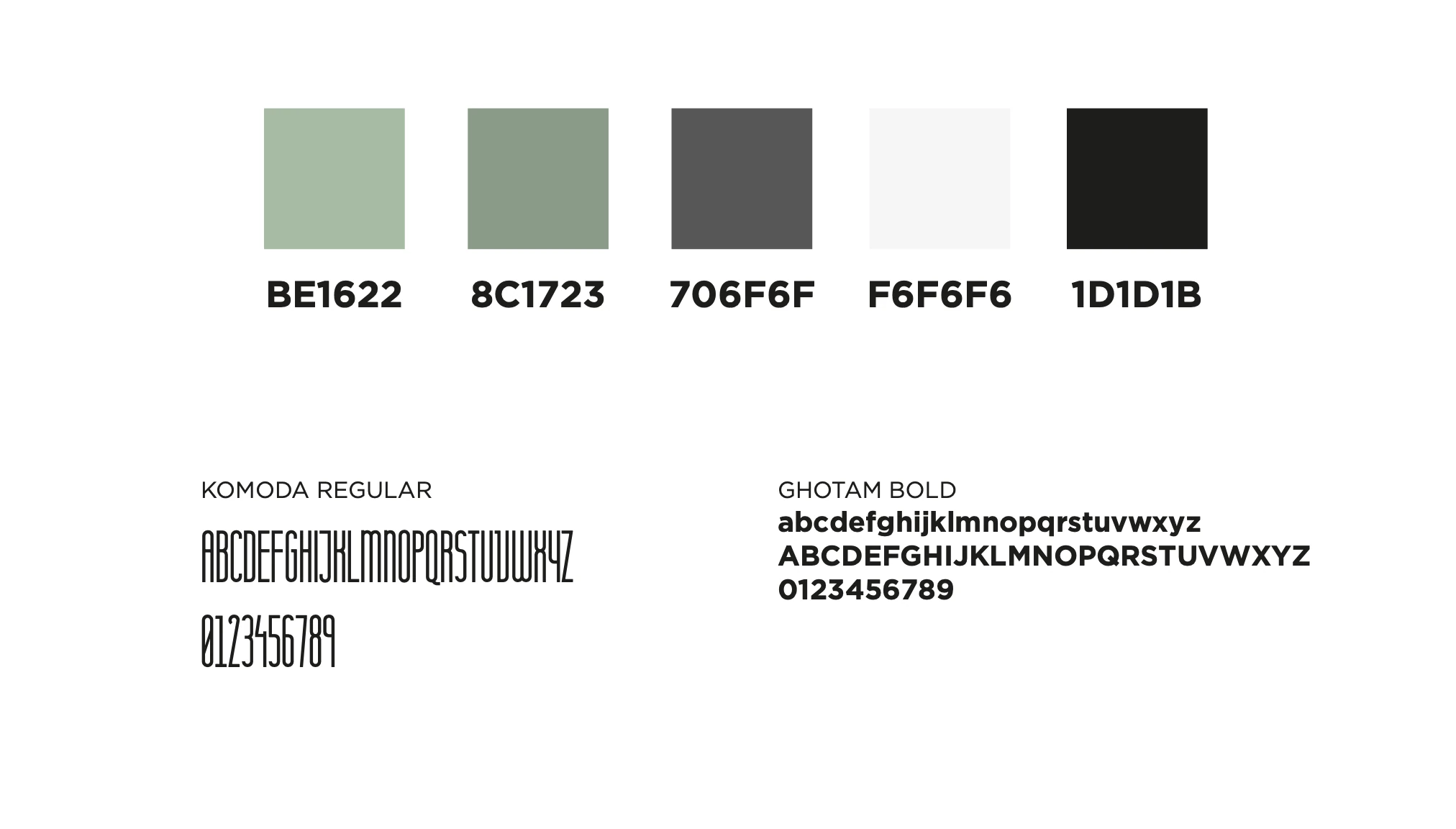
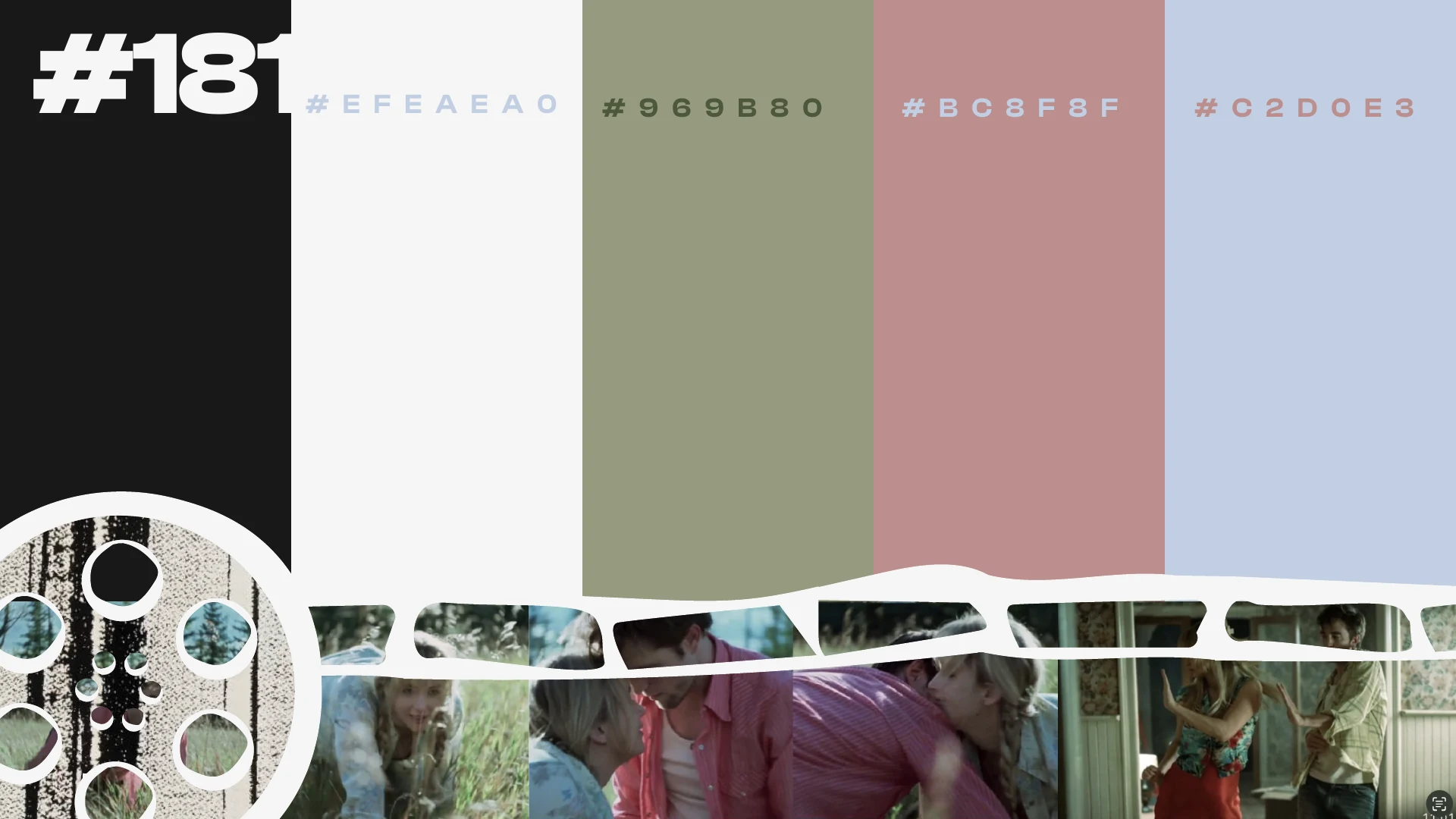
35 MM Film Festival — previous palette and typefaces
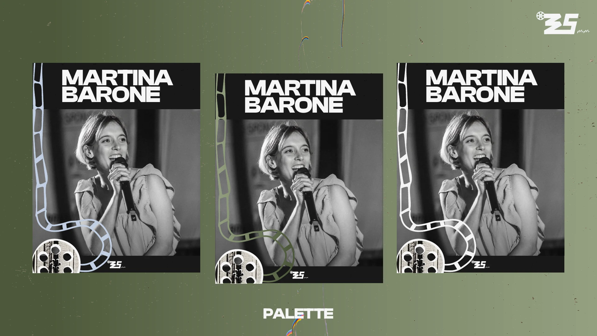
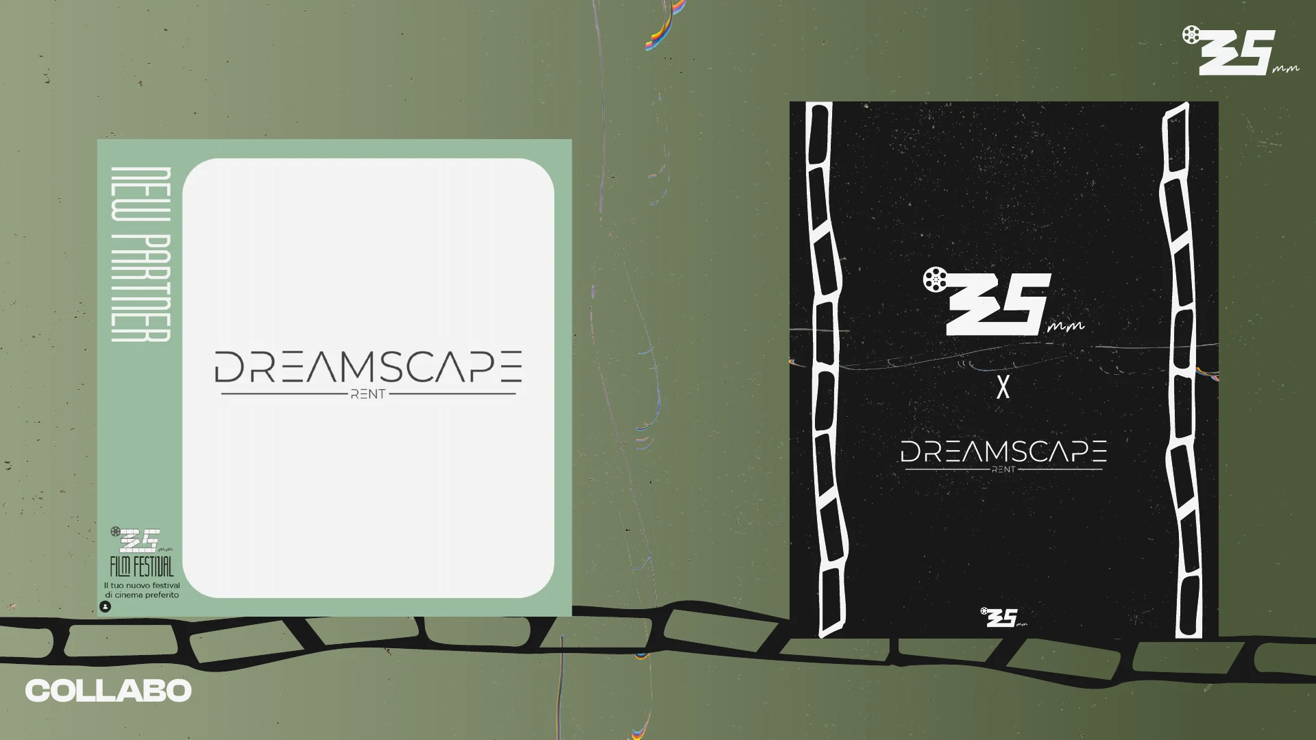
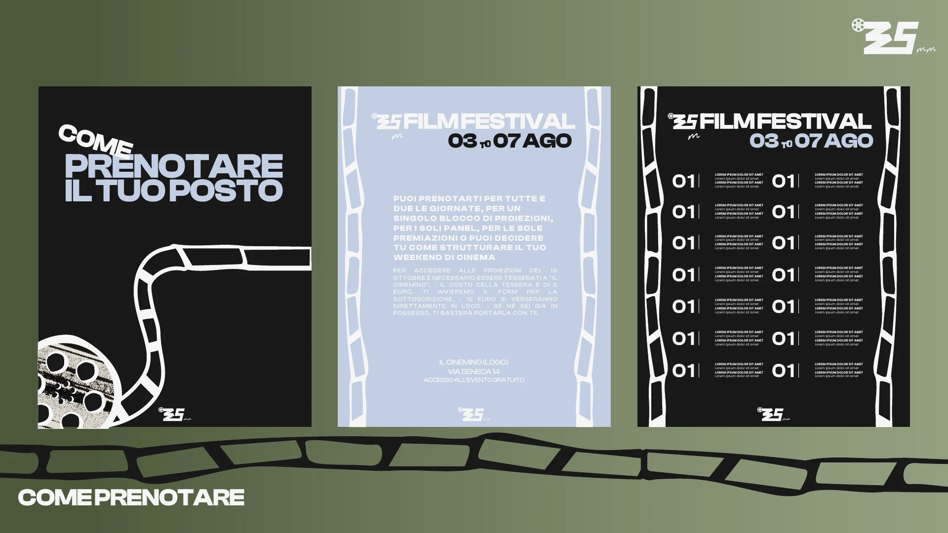
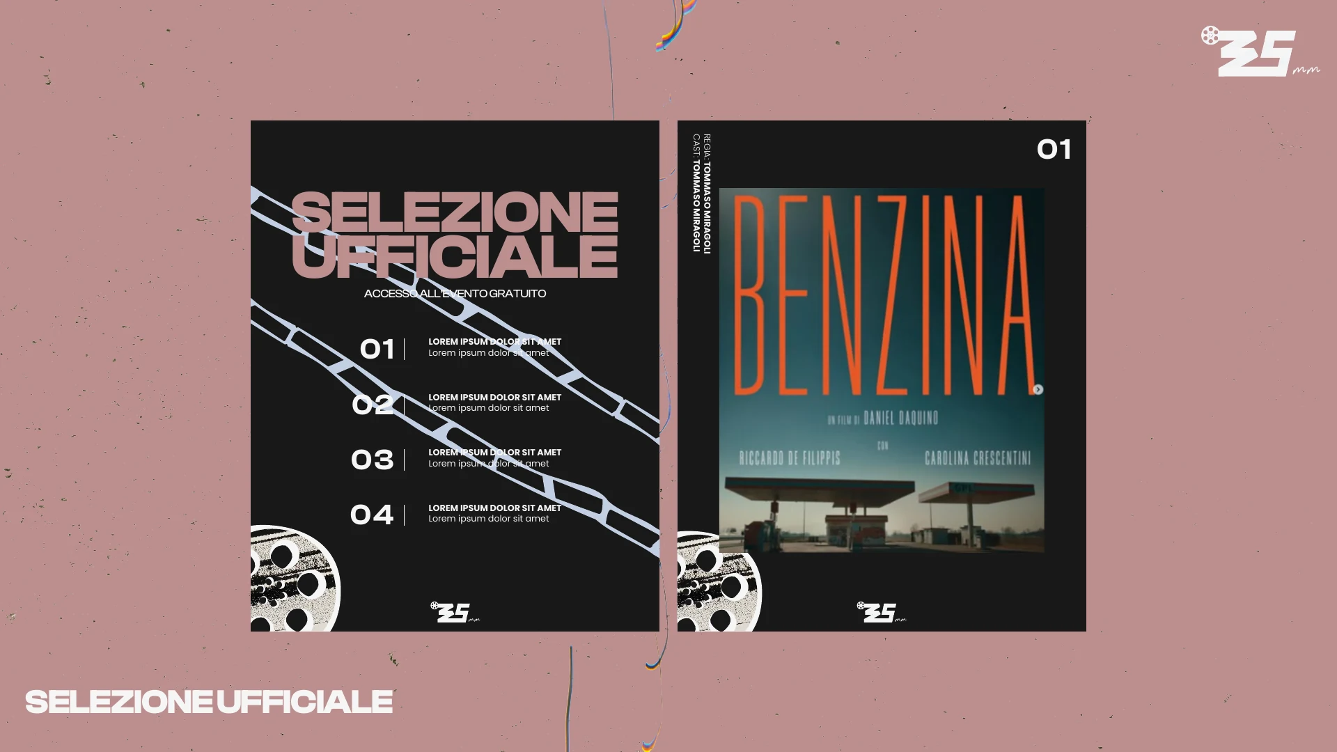
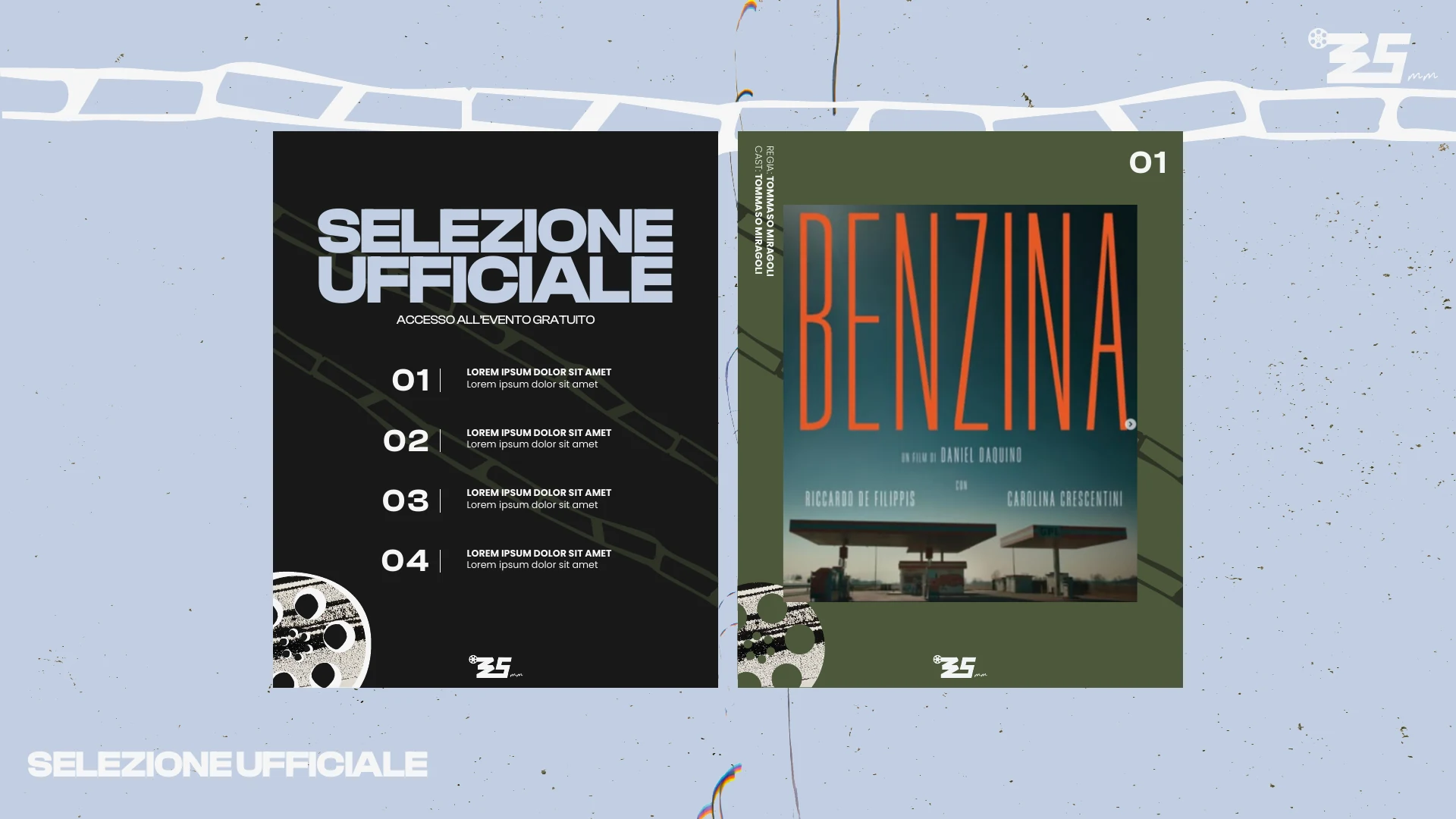
35 MM Film Festival rebranding 02
35 MM Film Festival rebranding 03
35 MM Film Festival rebranding 04
35 MM Film Festival rebranding 05
35 MM Film Festival rebranding 06
35 MM Film Festival rebranding 07
35 MM Film Festival rebranding 08
35 MM Film Festival rebranding 09
35 MM Film Festival rebranding 10
35 MM Film Festival rebranding 11
35 MM Film Festival rebranding 12
35 MM Film Festival rebranding 13
35 MM Film Festival rebranding 14
35 MM Film Festival rebranding 15
35 MM Film Festival rebranding 16
35 MM Film Festival rebranding 17
35 MM Film Festival rebranding 18
35 MM Film Festival rebranding 19
35 MM Film Festival rebranding 20
35 MM Film Festival rebranding 21
35 MM Film Festival rebranding 22
35 MM Film Festival rebranding 23
Overview

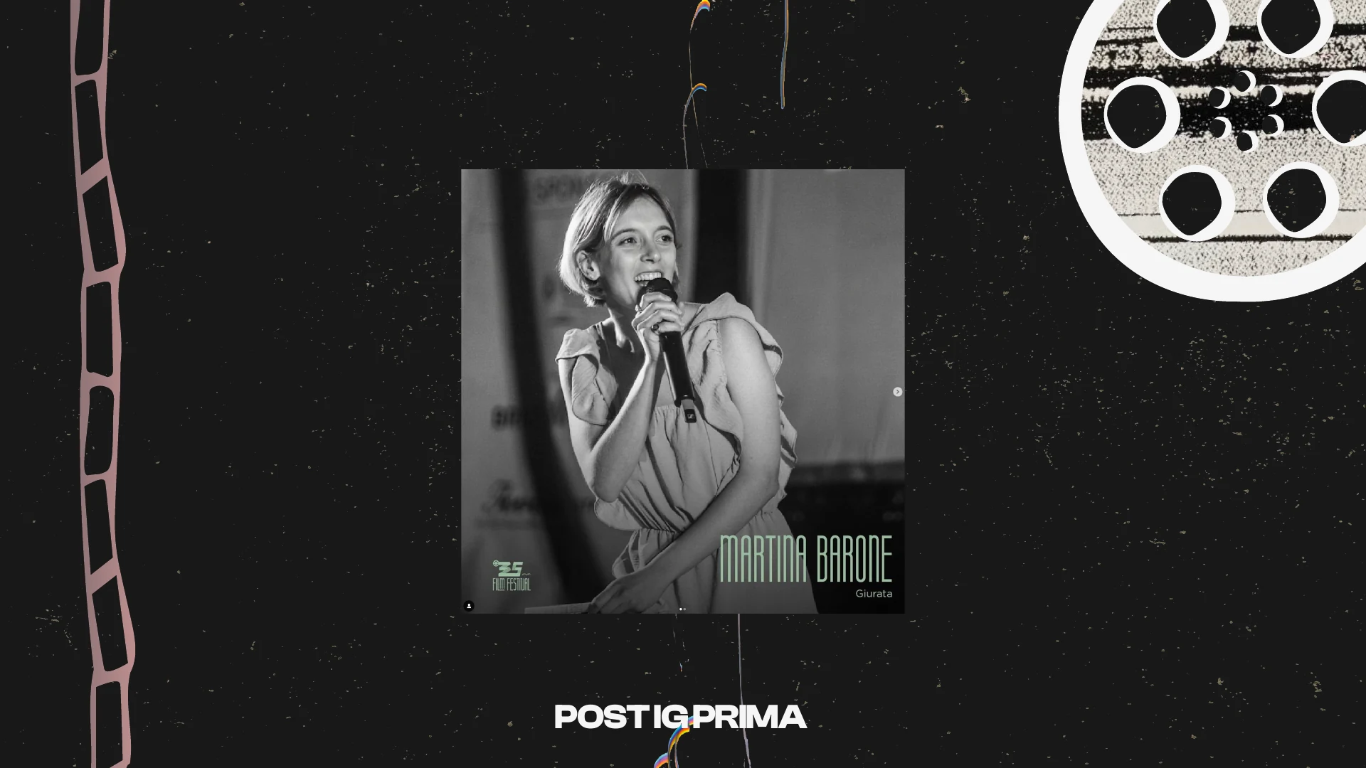
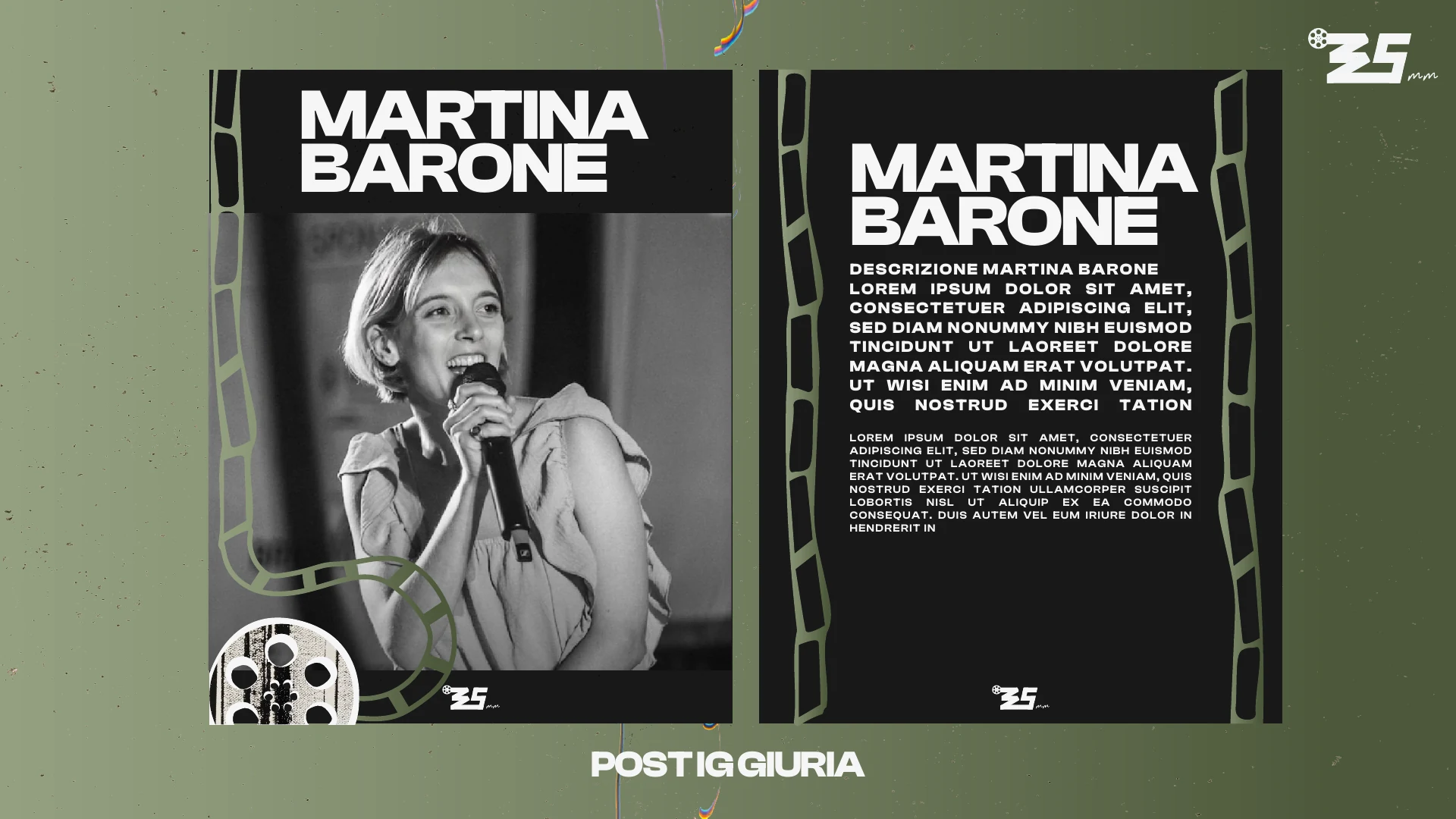
Rebranding a young film festival for its second edition, from literal illustration to a cinematic system.

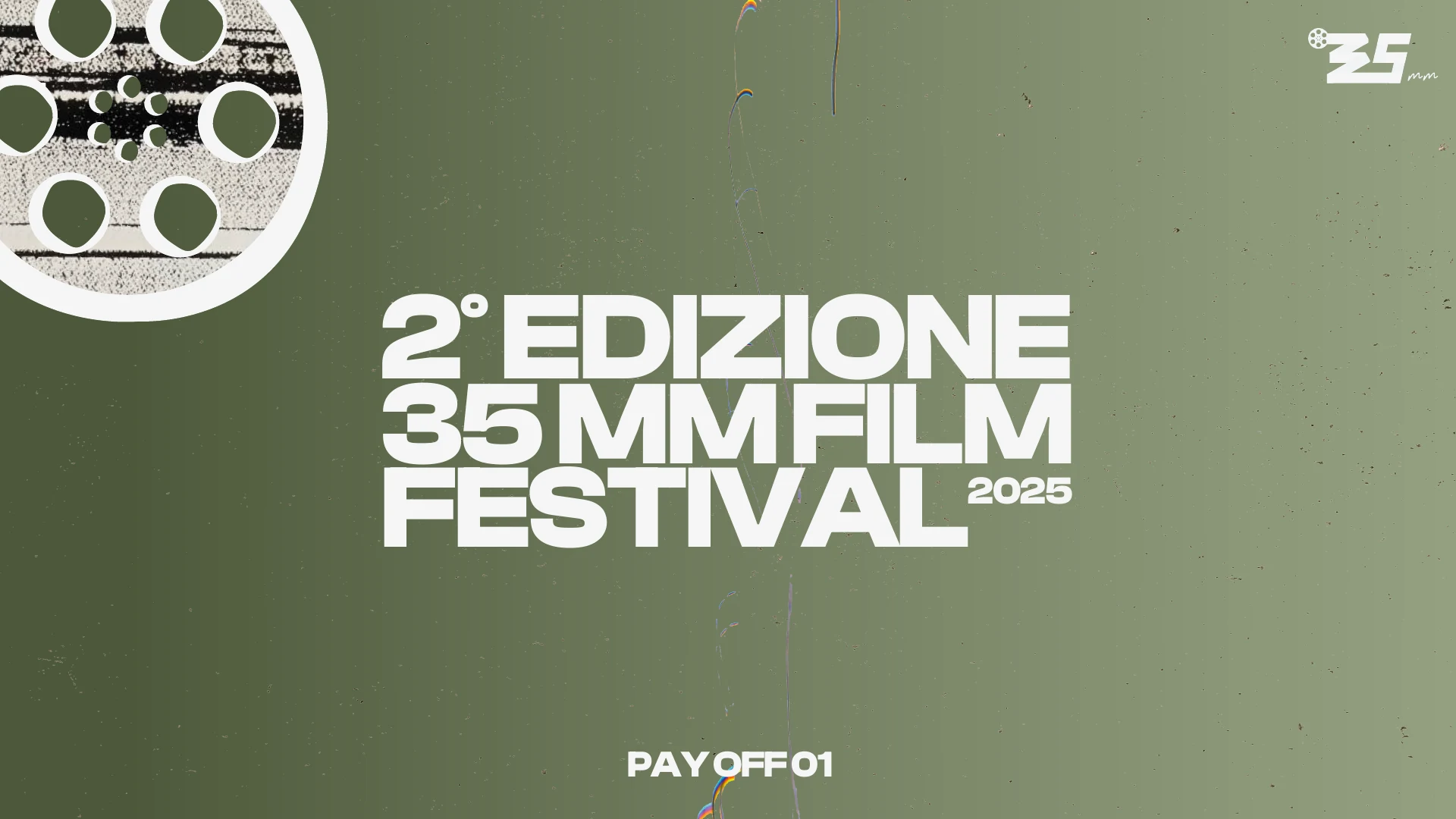
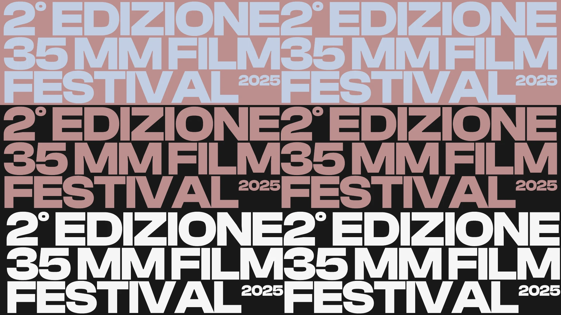
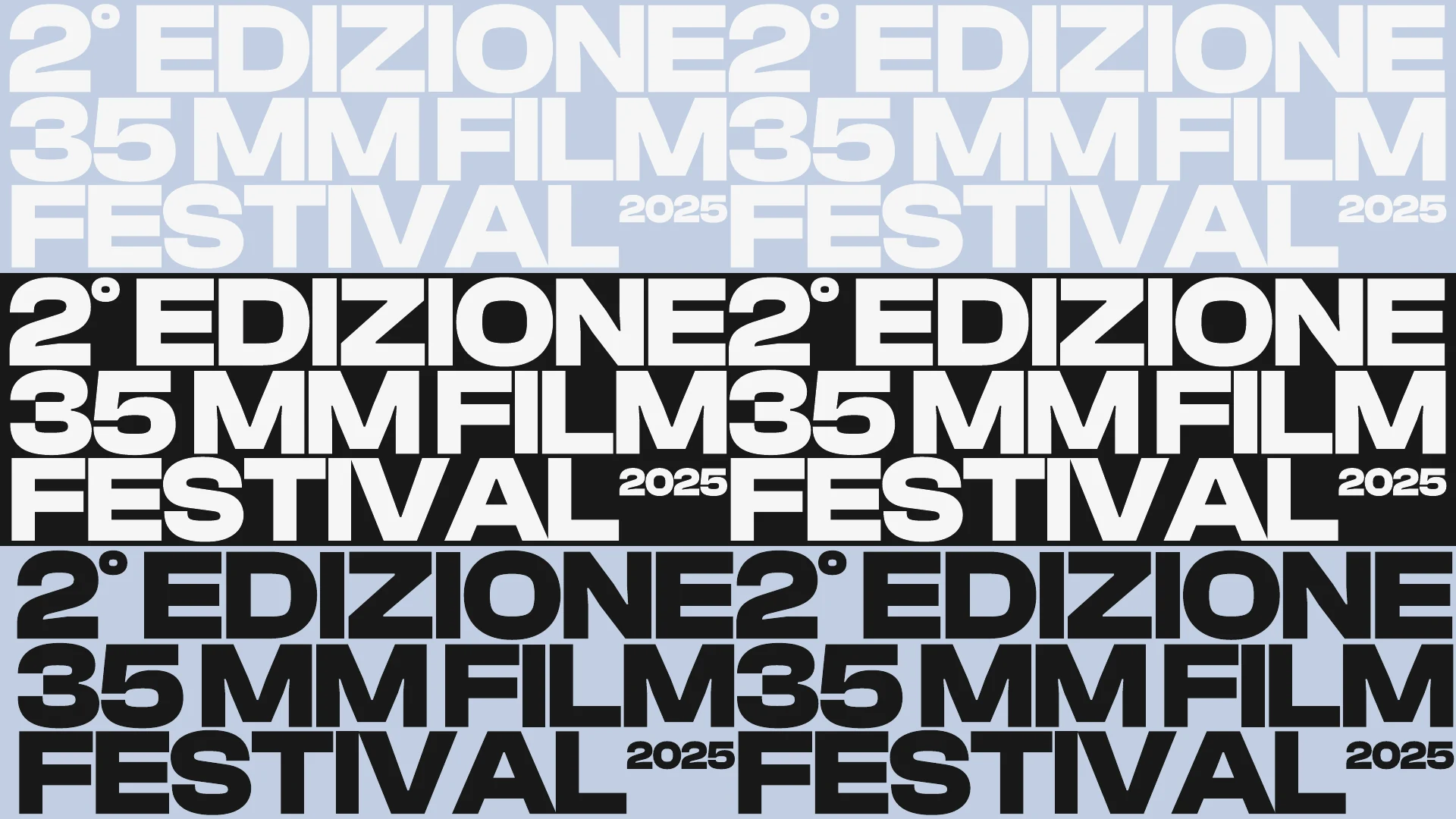
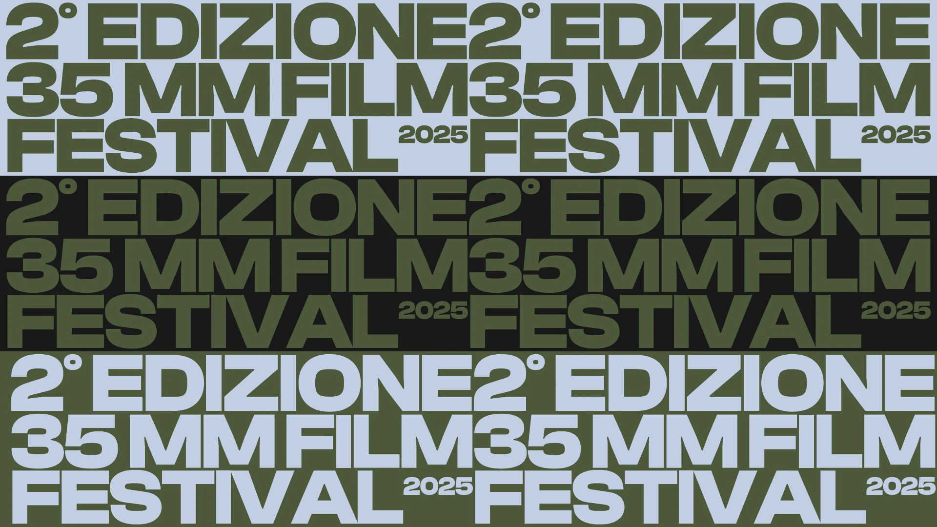
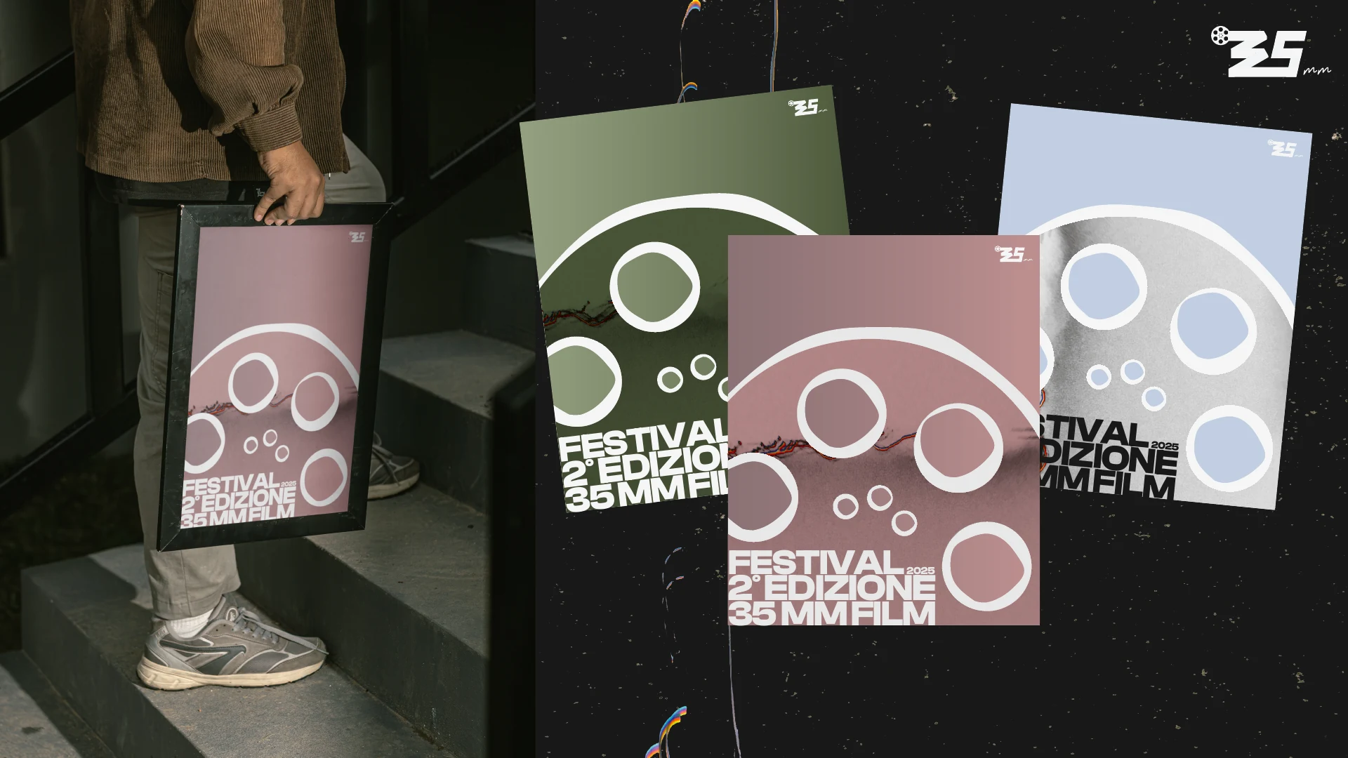
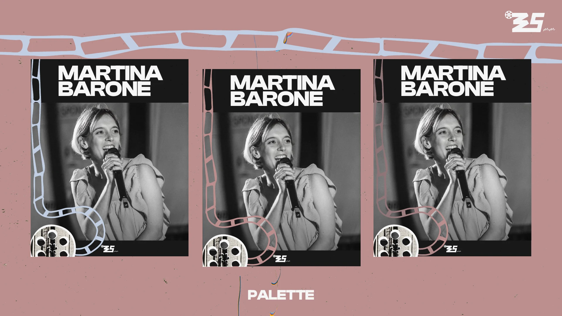
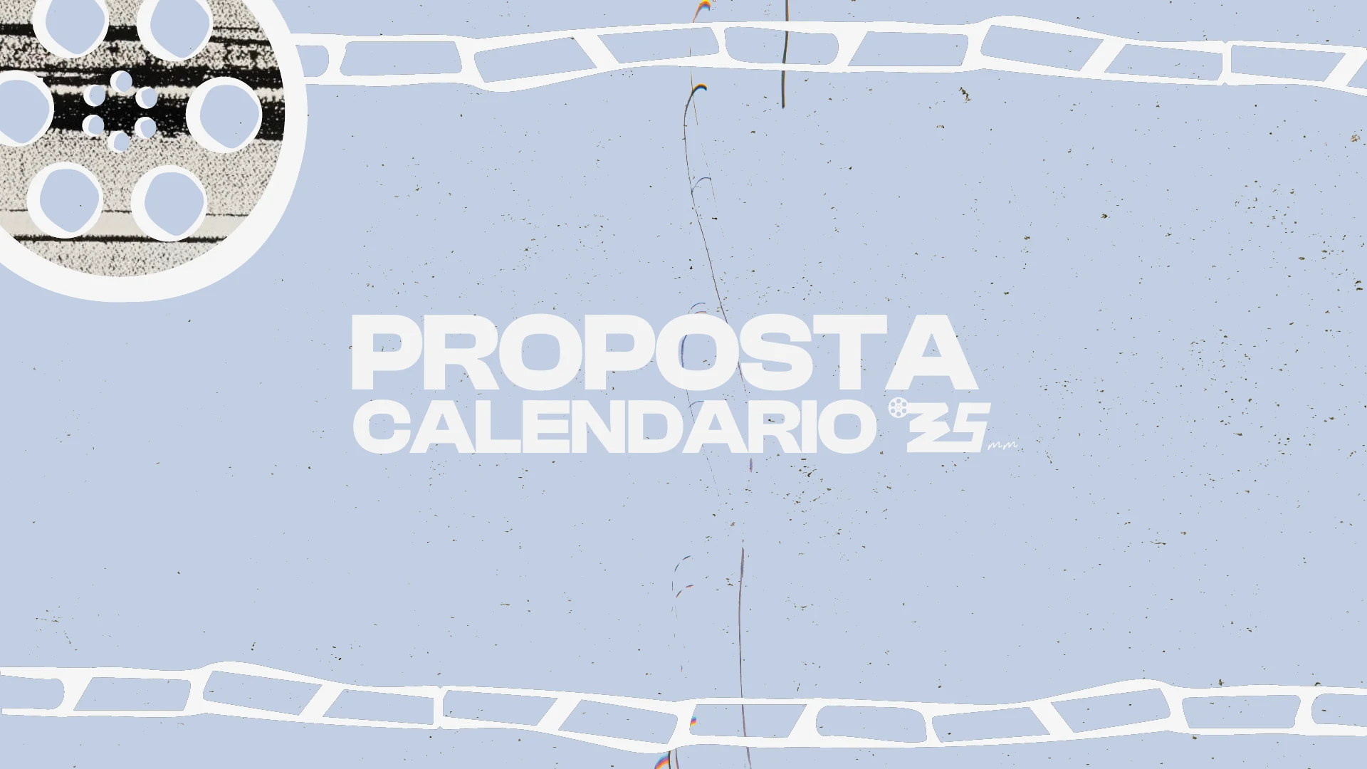
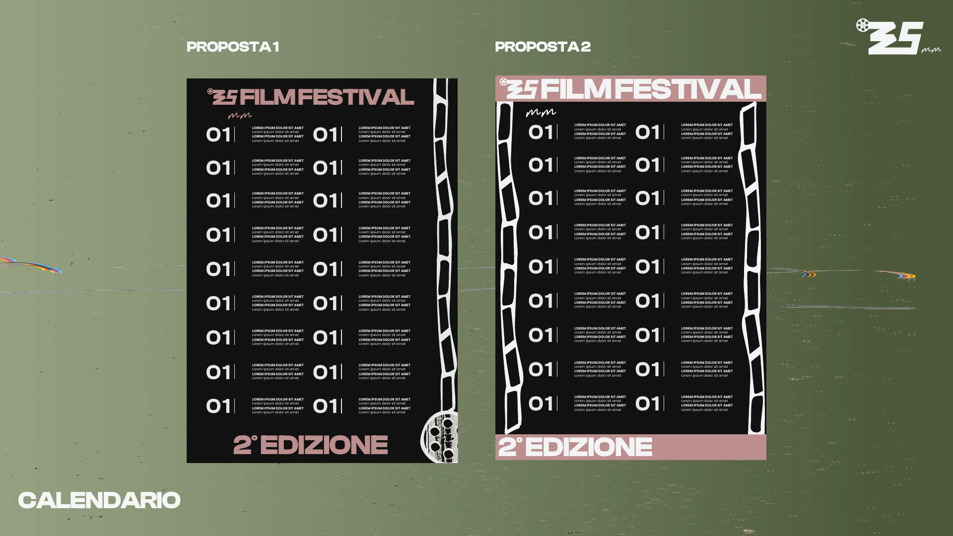
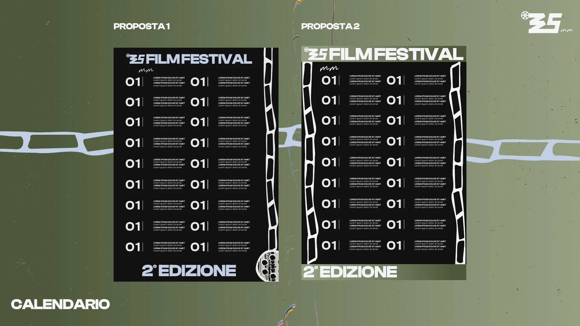
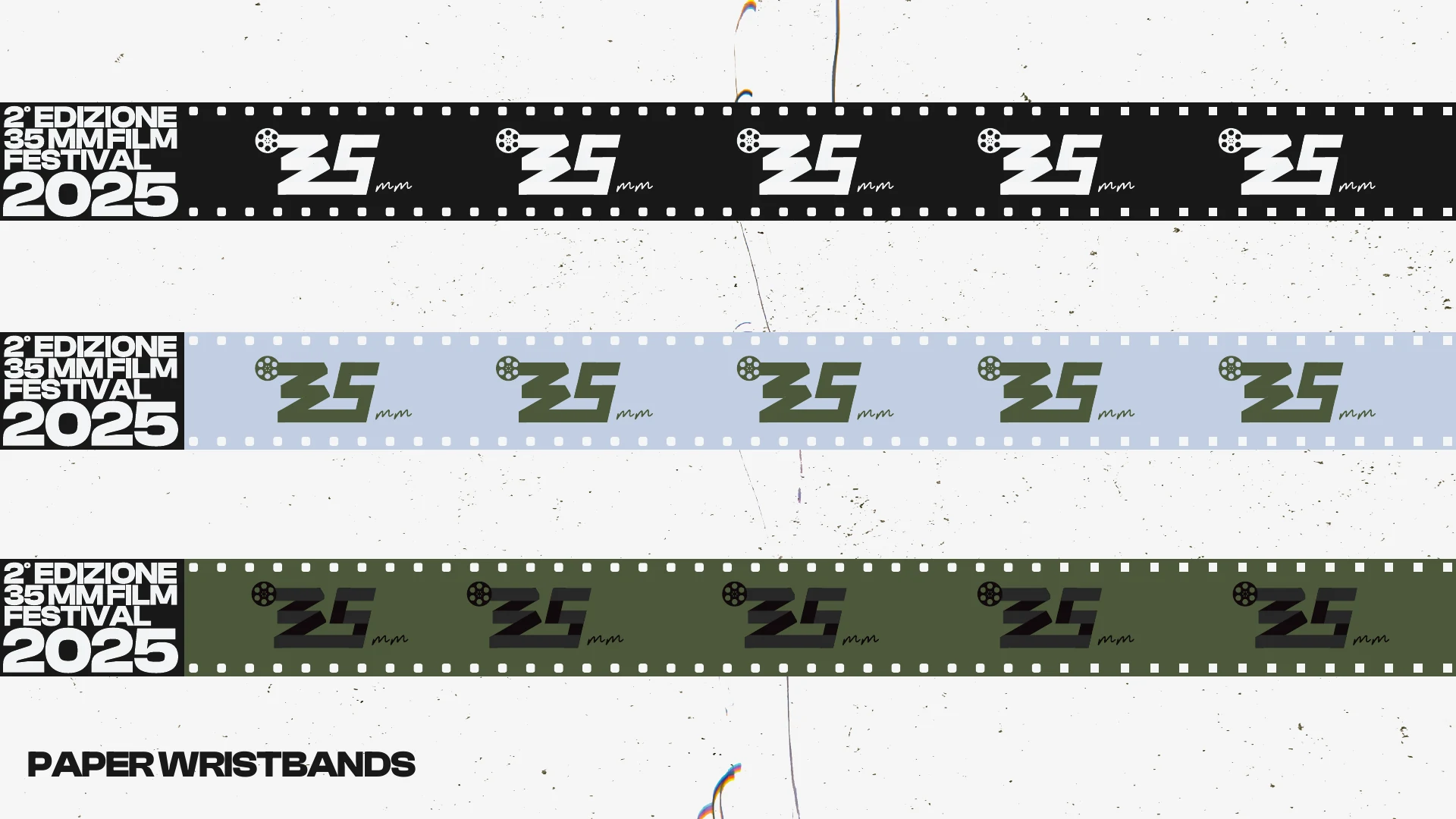
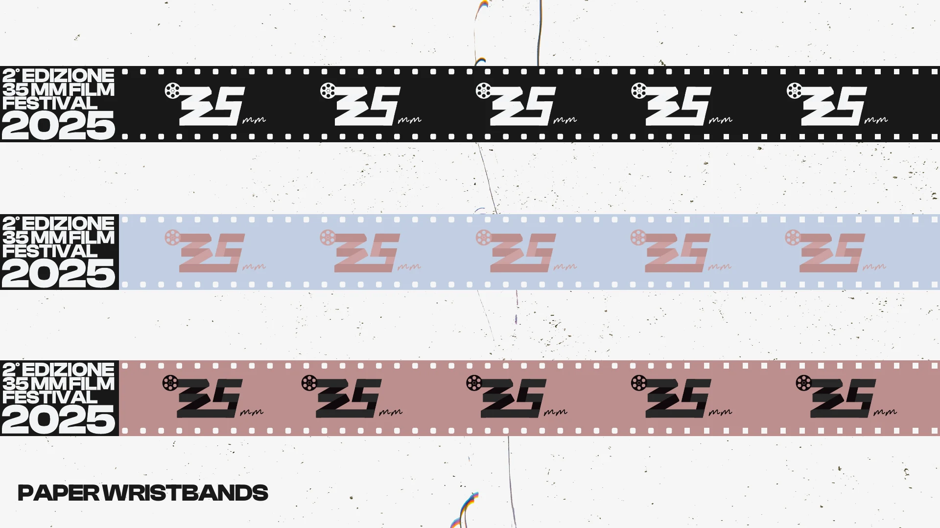
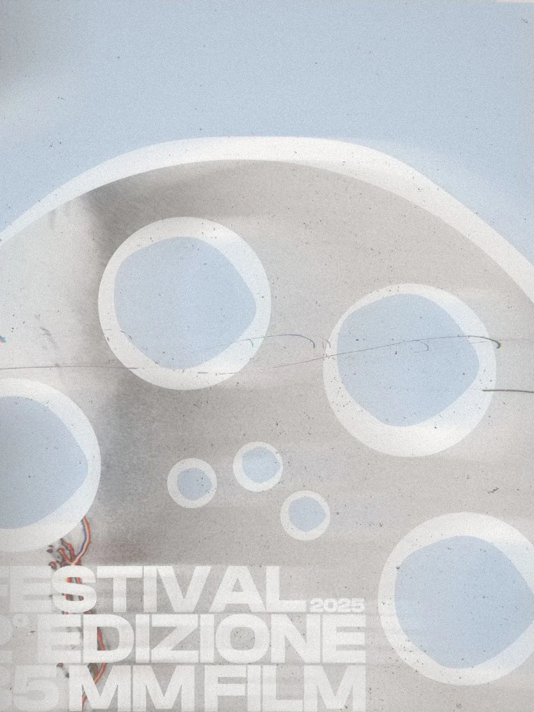
The original logo, a film strip and reel in muted green, was redrawn into a compact, contemporary mark. A new palette of black, warm white, sage, dusty rose and light blue, reel graphics and a strong typographic payoff shape posters, Instagram content, the official selection, the calendar and the wristbands.

10

Horseshop Brewery

A playful identity for a craft brewery with a horse’s personality.

Scope

Brand Identity
Illustration
Packaging
Signage

Year

2020

Horseshop Brewery — logo
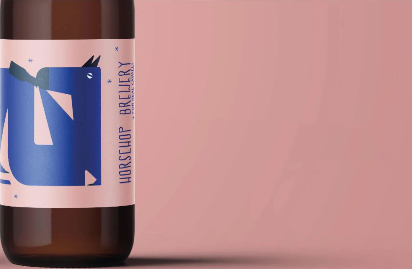
Horseshop Brewery — label close-up
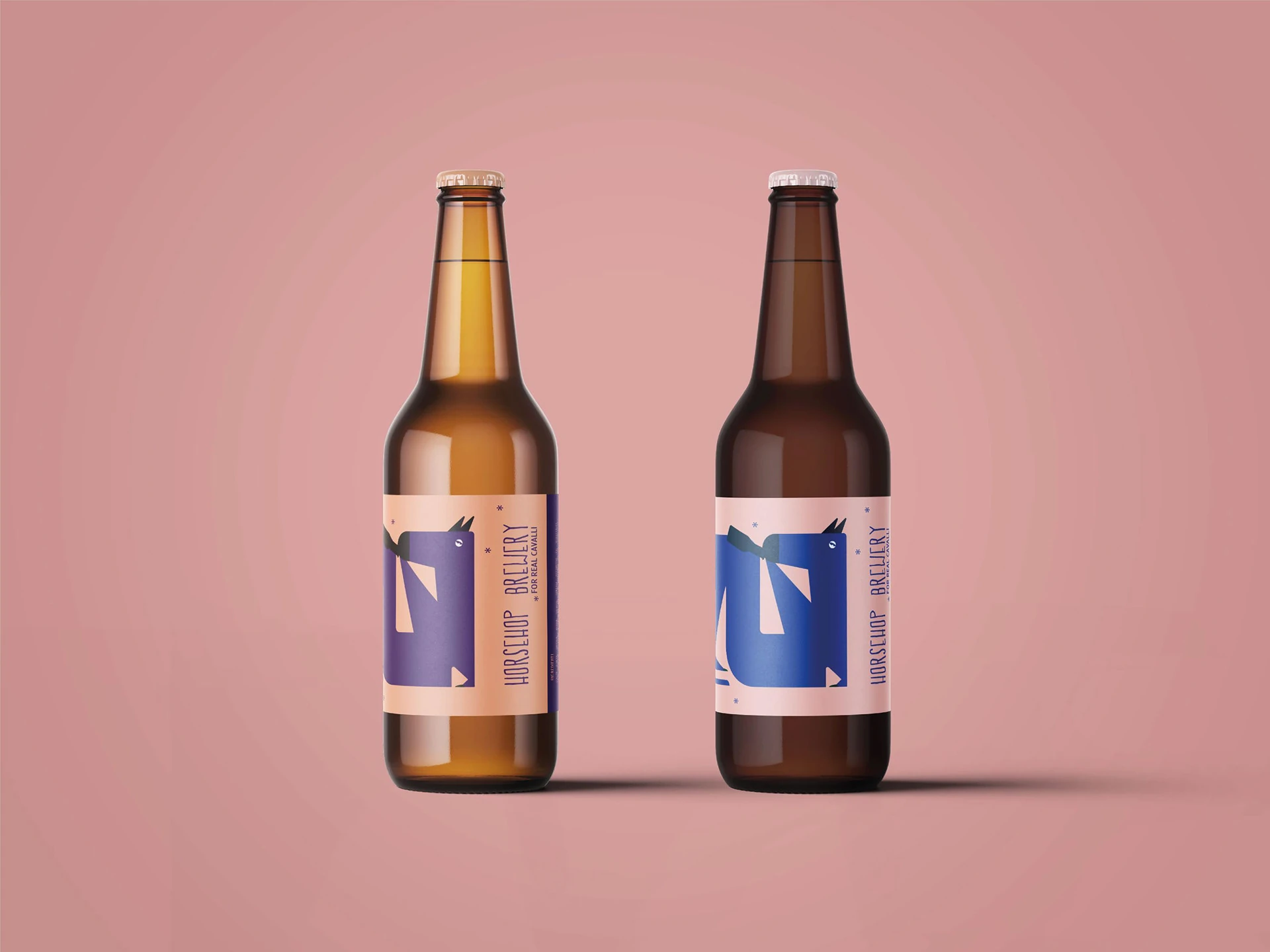
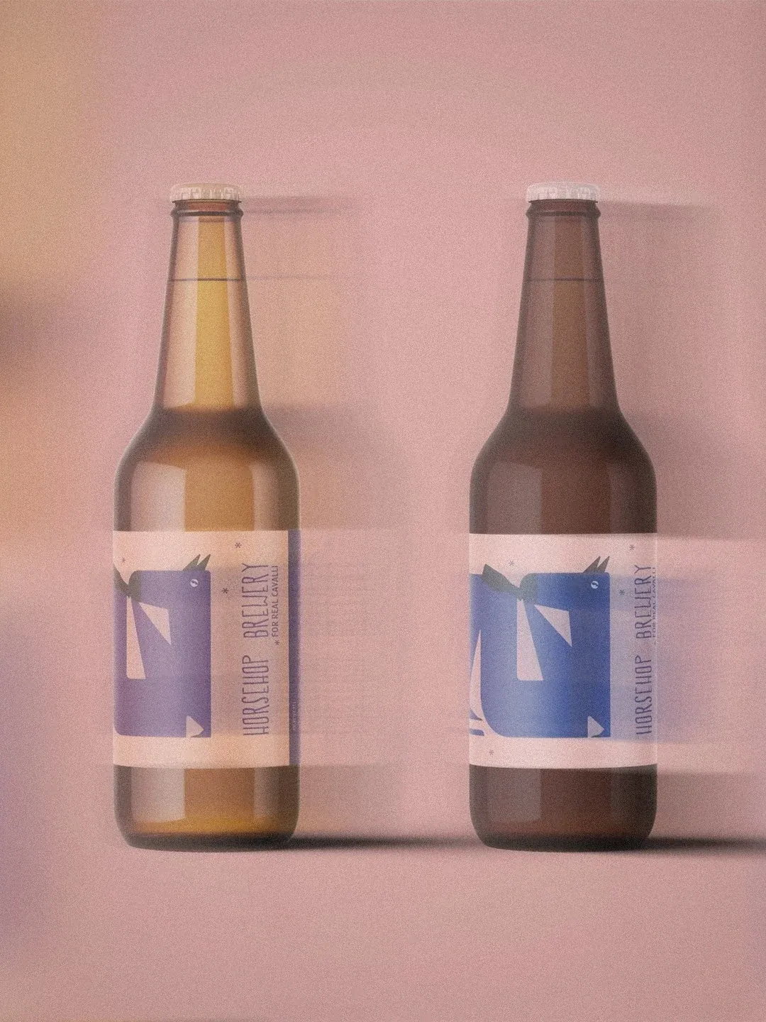
Horseshop Brewery — bottles
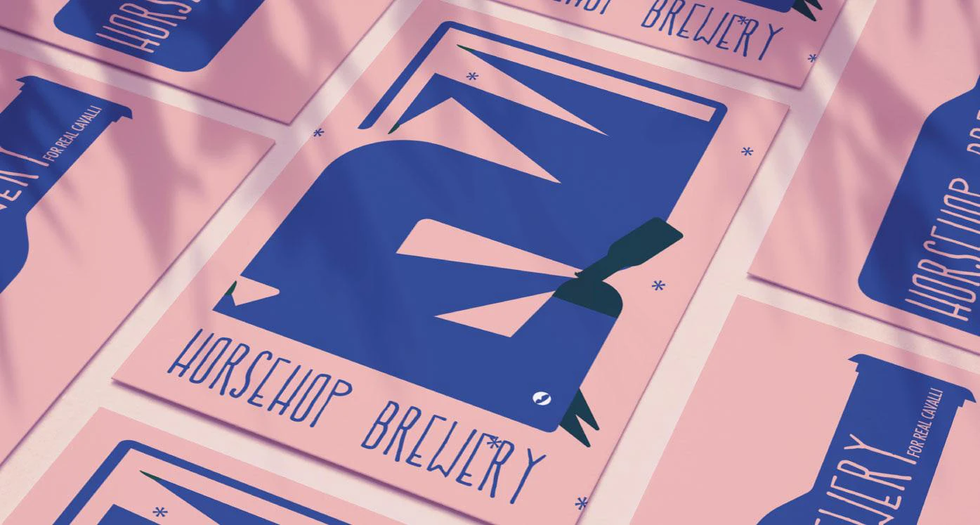
Horseshop Brewery — posters
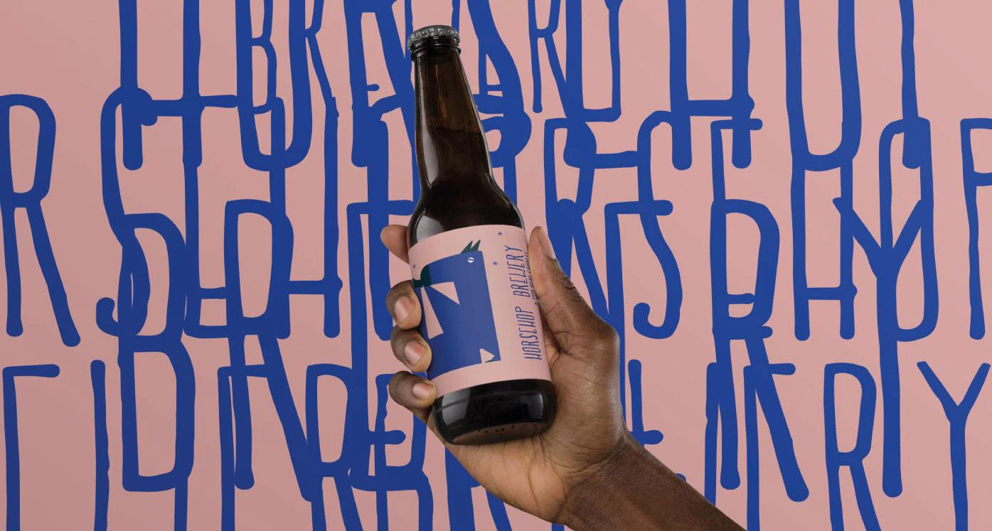
Horseshop Brewery — bottle in hand
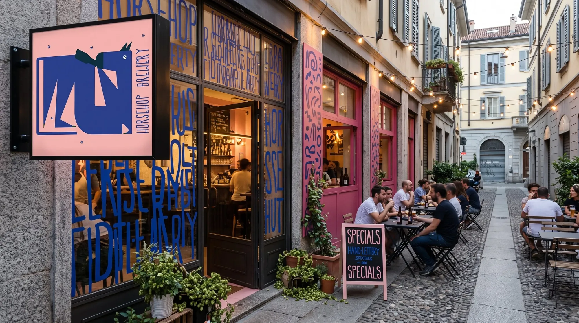
Horseshop Brewery — storefront
Overview

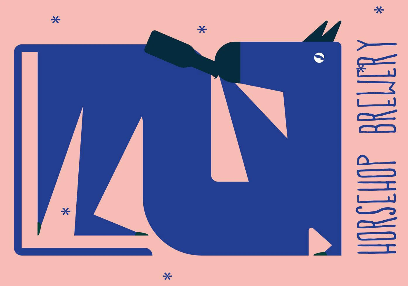
A playful identity for a craft brewery, built around one unmistakable geometric horse.

Flat blue shapes on soft pink, hand-drawn condensed lettering and small star details give the brand an ironic, approachable tone. It moves from labels and posters to the shop sign and windows, turning the venue itself into part of the brand. For real cavalli.

Brand, Visual& DigitalDesigner.

I design identities, campaigns and digital experiences that turn strategy into clear, memorable visual systems.

Selected work
Approach

I translate complex ideas into systems that can live across identity, editorial, digital and physical space.

About

I design visual systems that help brands communicate with clarity, character and consistency.

Profile

Sofia Bertini

Brand, Visual & Digital Designer

Based in Milan

Expertise

Brand Identity

Creative Direction

Editorial & Digital Design

UX/UI Design

Contacts

sofiabertini96@gmail.com

+39 391 4940460

LinkedIn